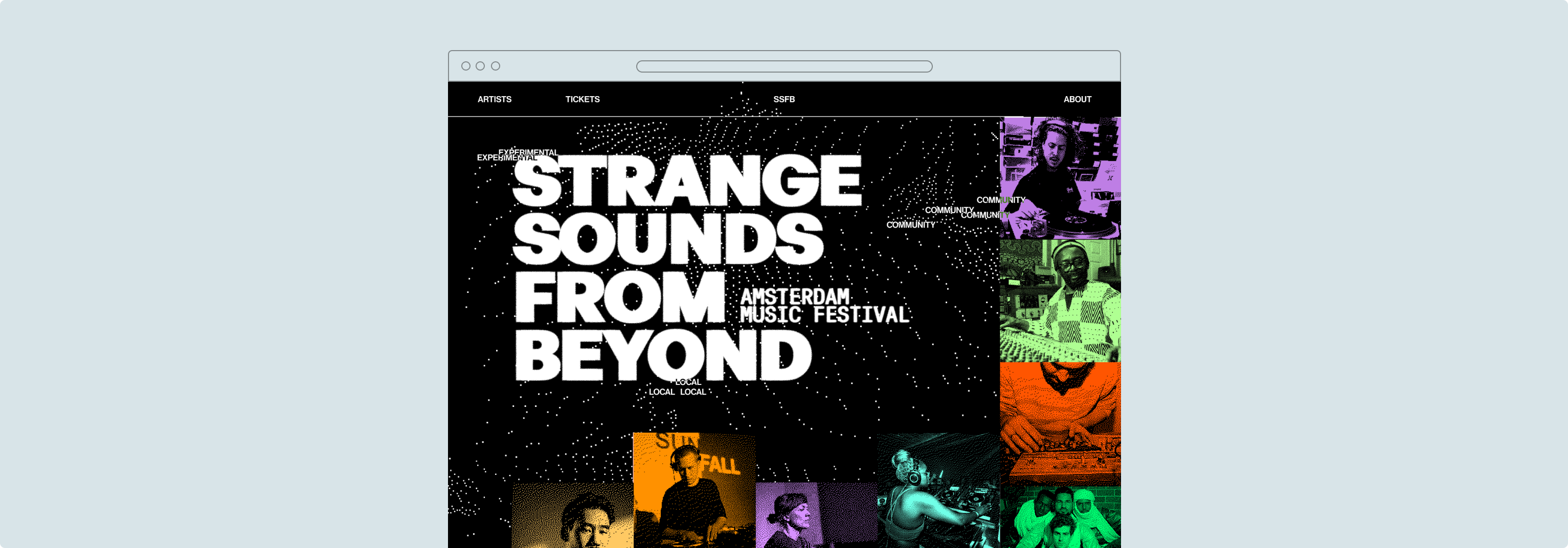
Integrating creation into navigation,
to anchor memories to human
journeys.
[ SPARKJAM 2026 ]
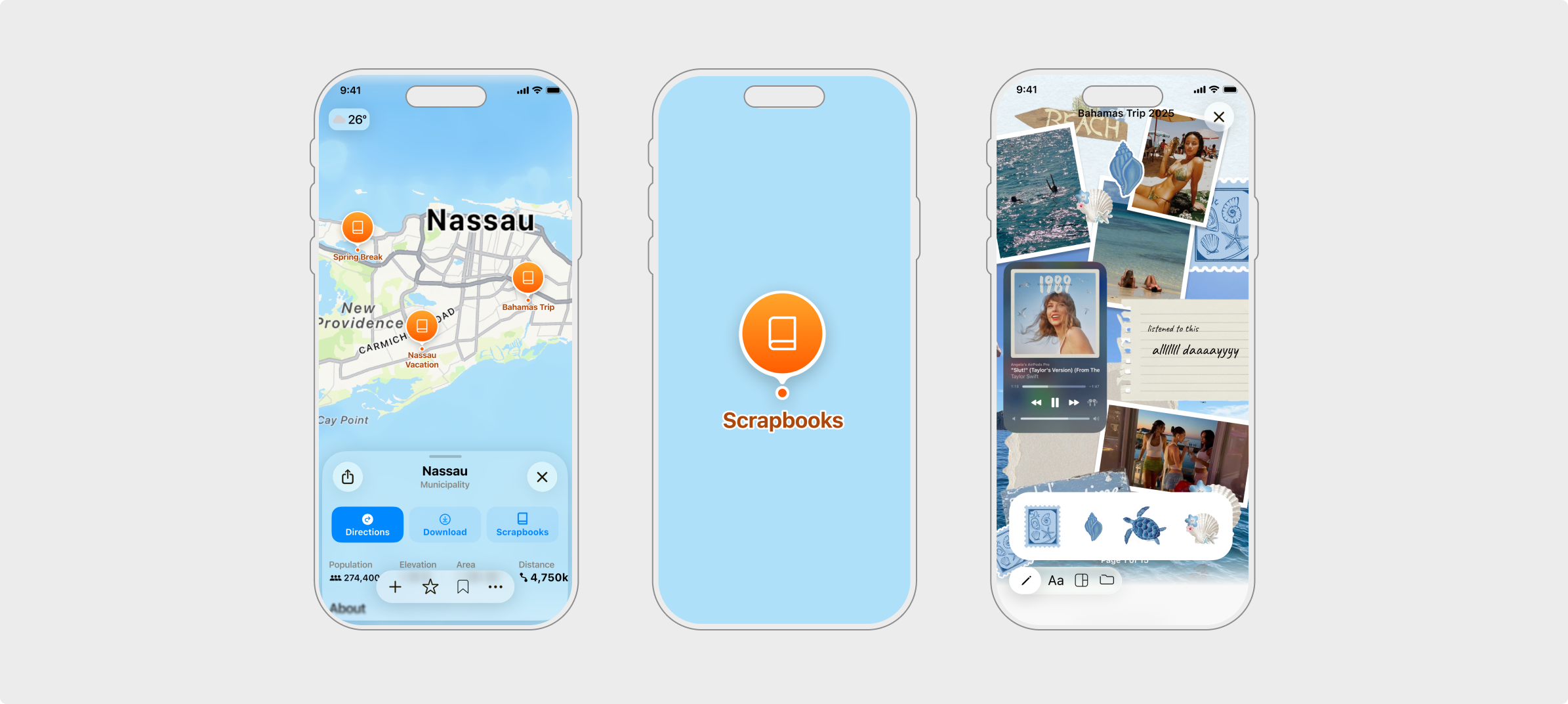
With a brief to design a creation-tool for a non-creative-centric product, our team designed Apple Maps ScrapBooks, a feature that allows users to create digital scrapbooks of their journeys.
[ OVERVIEW ]
Designing memory into the map
Over six days at SparkJam 2026 (a design jam with 300+ participants) our team of four concepted & designed Apple Maps ScrapBooks, a feature that lets users build digital scrapbooks of their journeys, anchoring memories to the places they happened. This project led us to taking home a prize for Best Community Centred Project.
[ MISSION ]
How can we embed a creation tool into Apple Maps so that travellers can capture, preserve, and share their journeys; without adding friction to the experience?
[ PROBLEM ]
Travelling is messy
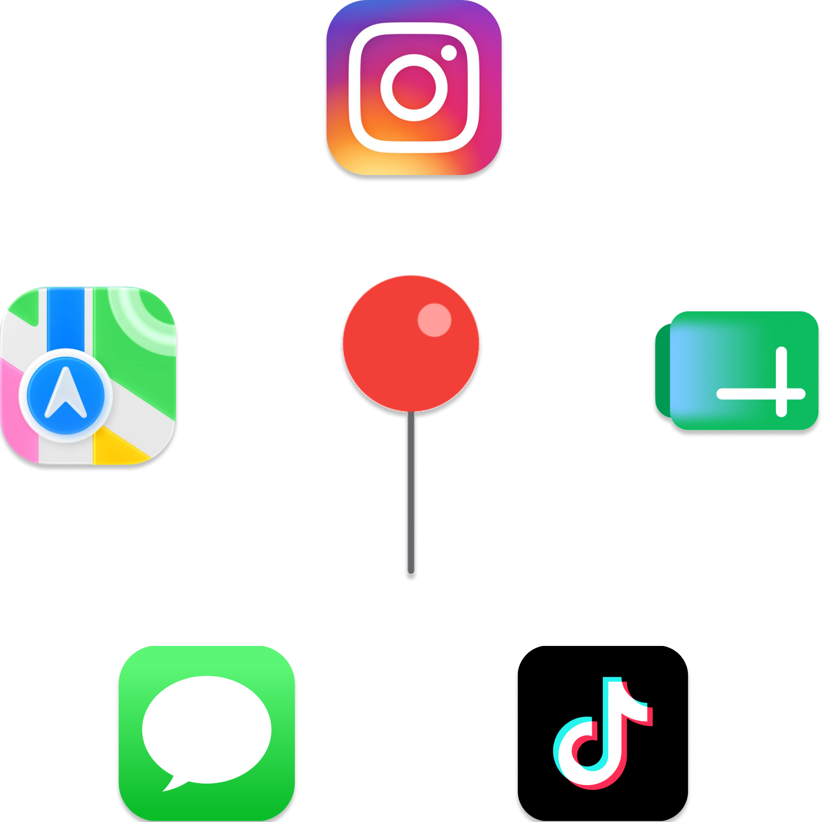
Travellers currently switch between 3-6 apps to plan a single trip.
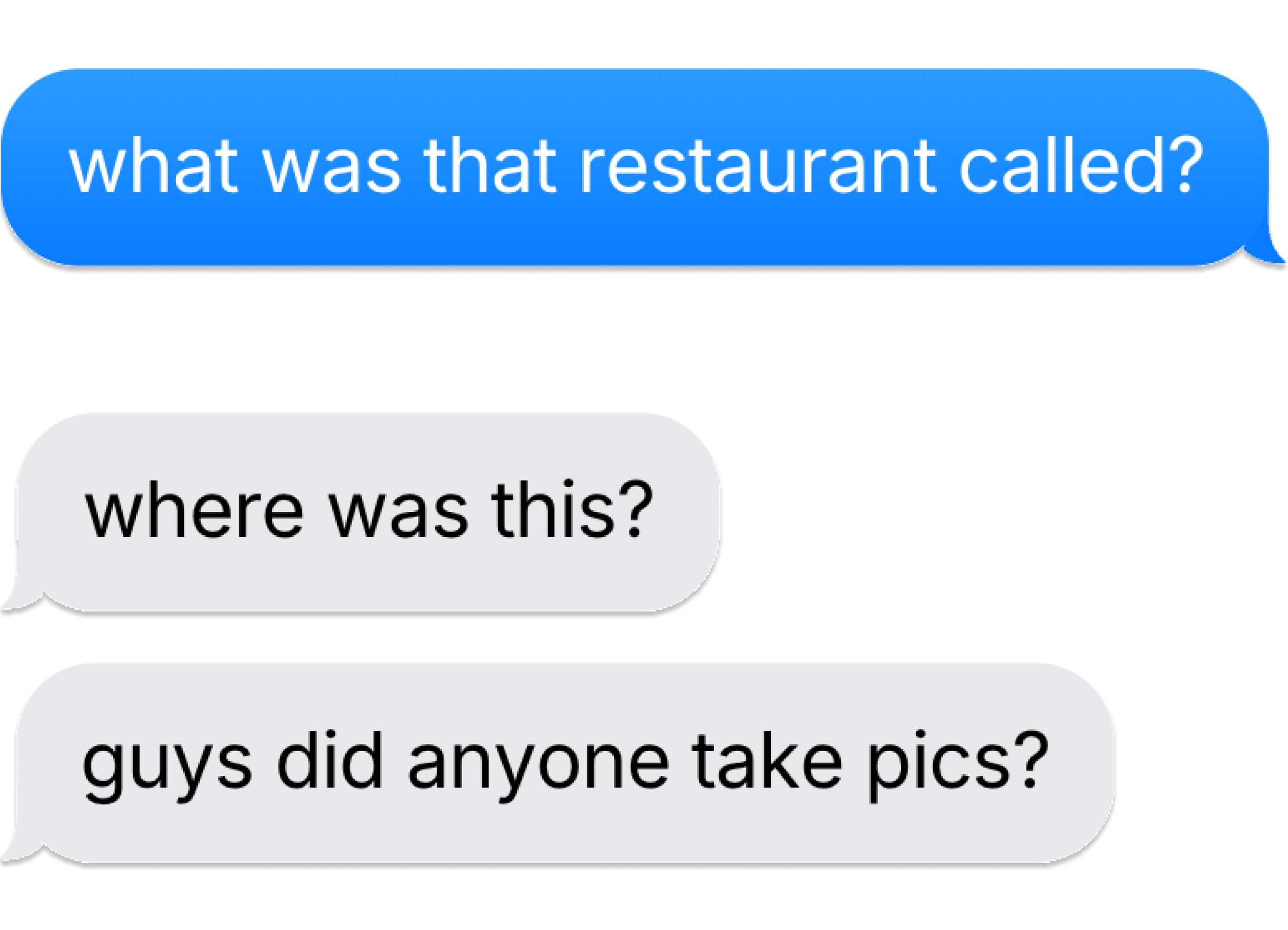
Existing navigation tools ignore the social side of travel, making it difficult for travellers to collaborate on trips.
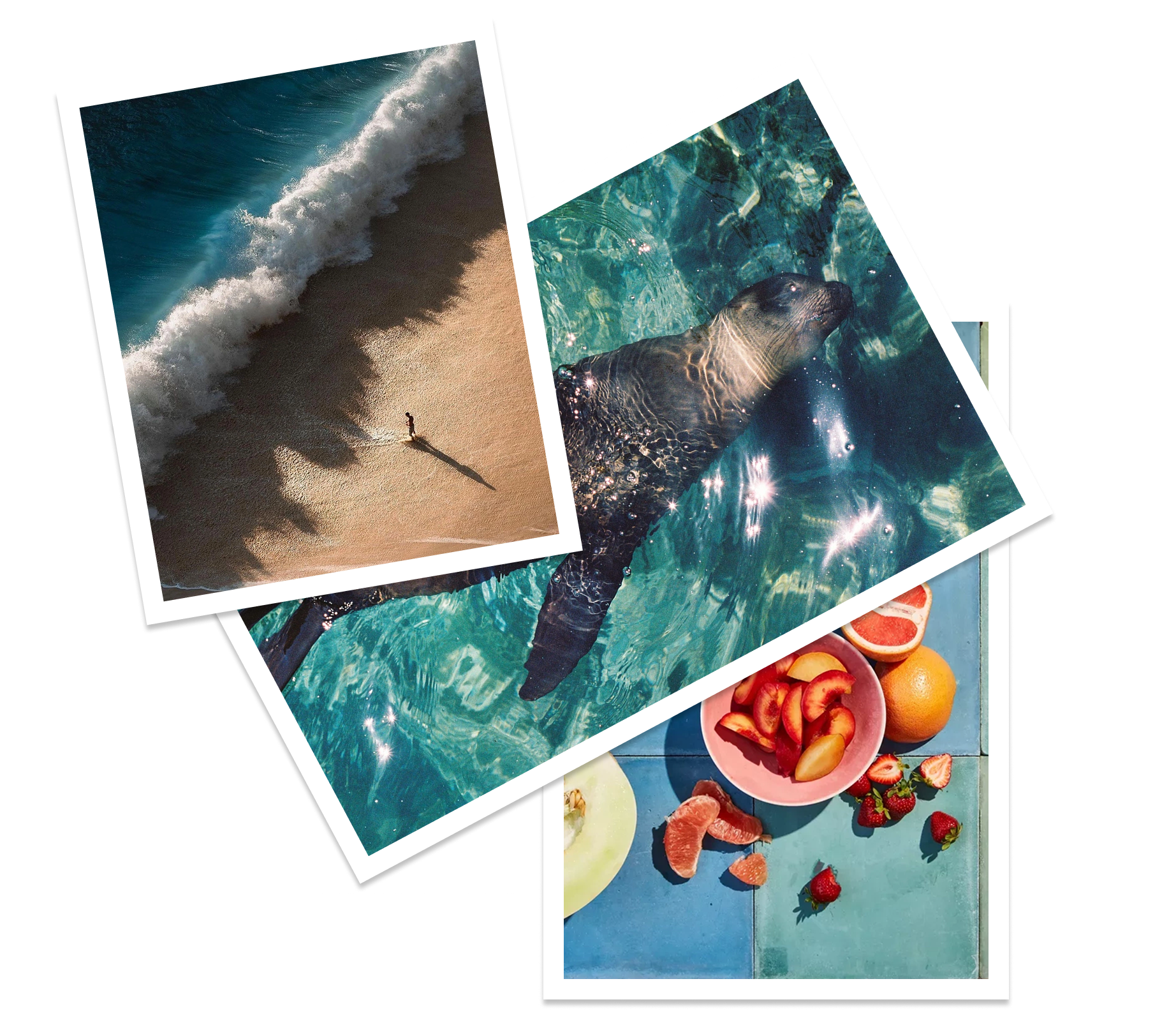
People forget the context of their memories, leaving photos to be forgotten in their camera rolls.
[ SOLUTION ]
Apple Maps ScrapBooks
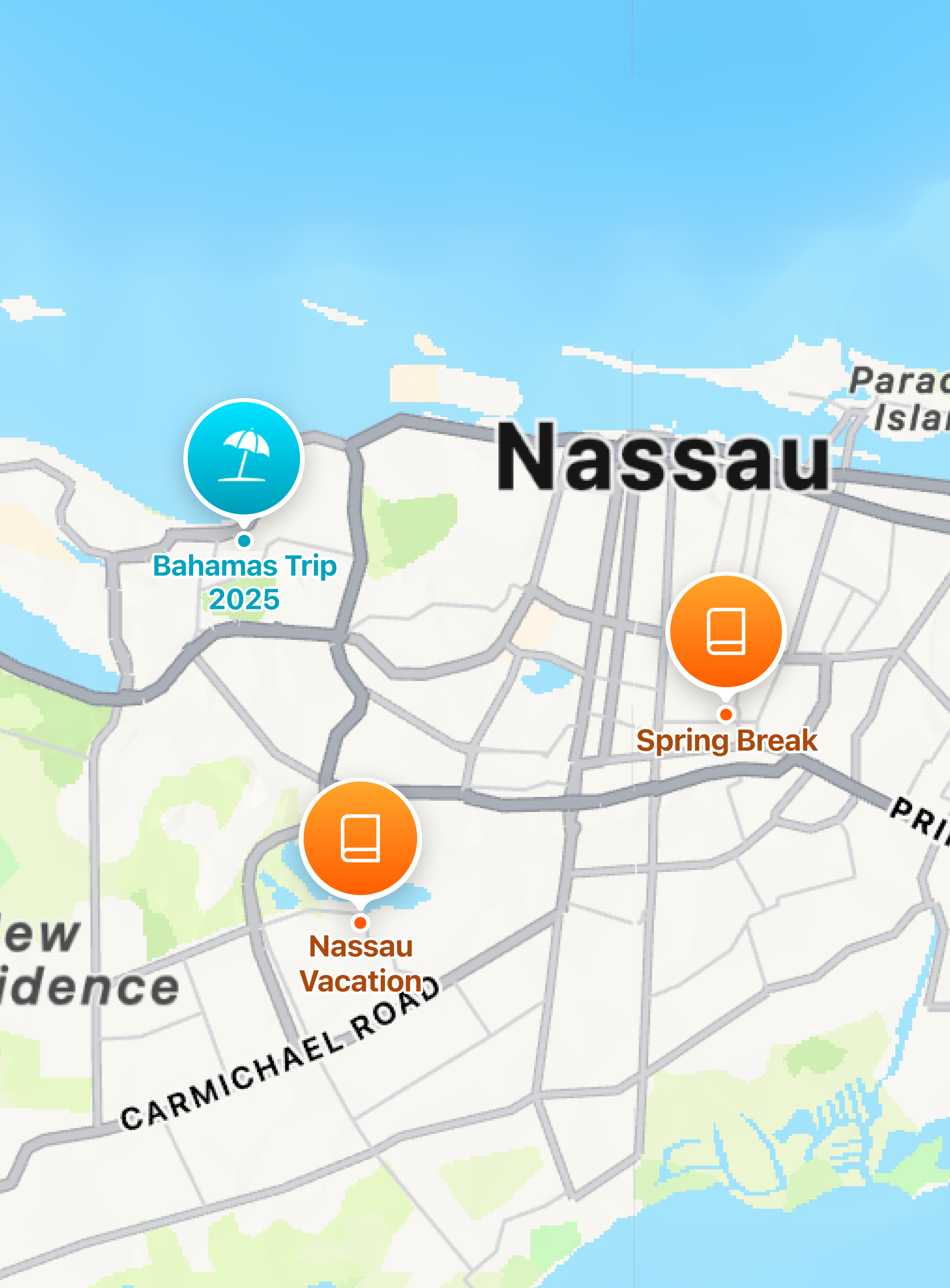
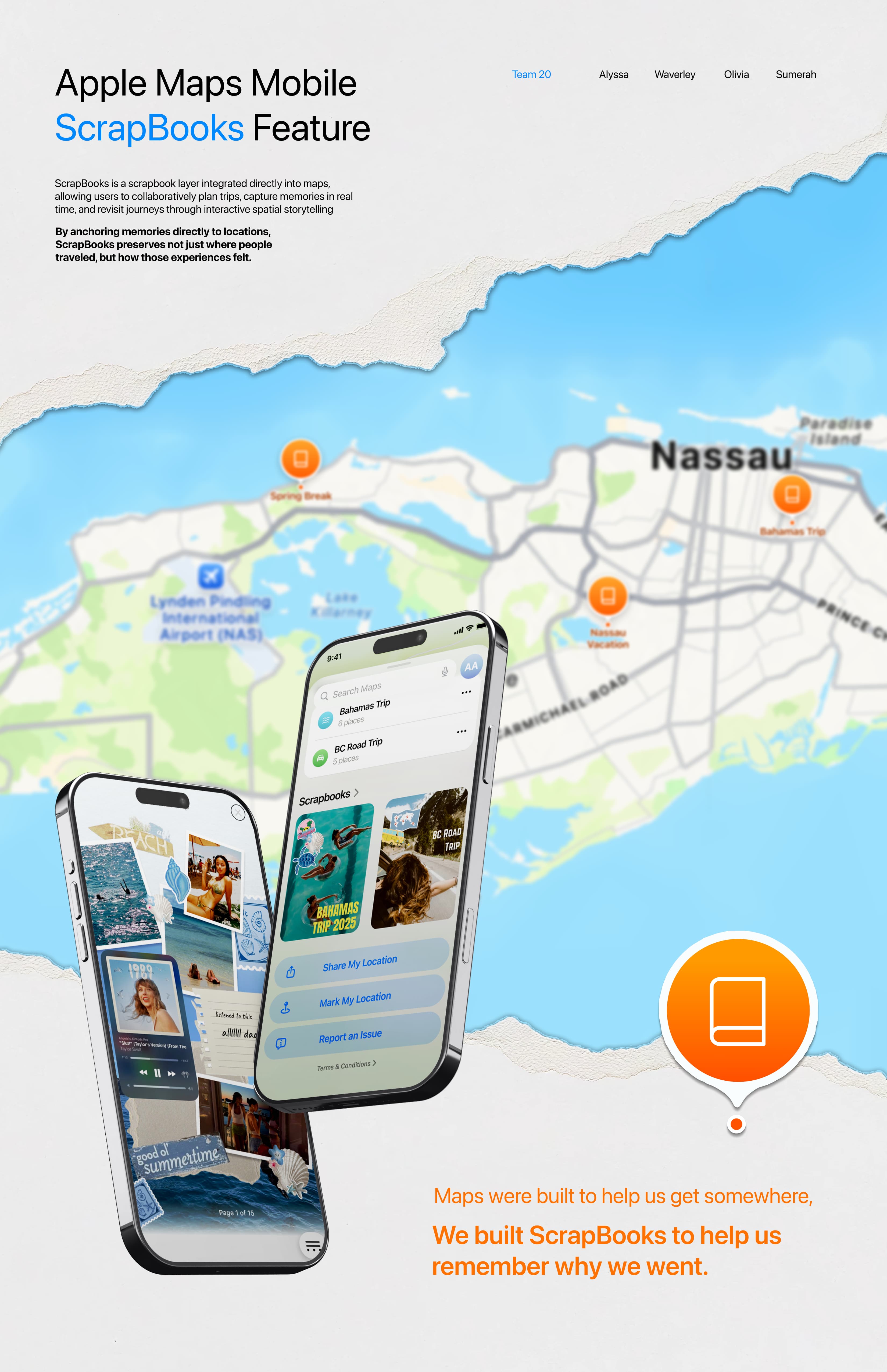
A scrapbook layer built directly into Apple Maps, allowing travellers to collaboratively plan trips, capture memories in real time, and revisit journeys through interactive storytelling. This reminds the user not just where they travelled, but how it felt to be there.
[ MY CONTRIBUTIONS ]
Below are my contributions to the research & design :)
[ RESEARCH ]
To understand our users, we designed a survey for Gen Z travellers, gaining insight from 35 potential users on how they plan trips and manage trip memorabilia. Here are the results.
Fragmented trip planning
PAIN POINT 1
Trip planning is often scattered across platforms, making it overwhelming and difficult to organize.
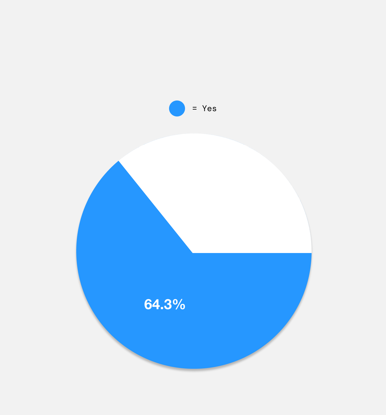
Majority of users said "Yes" when asked if they get overwhelmed by trip planning.
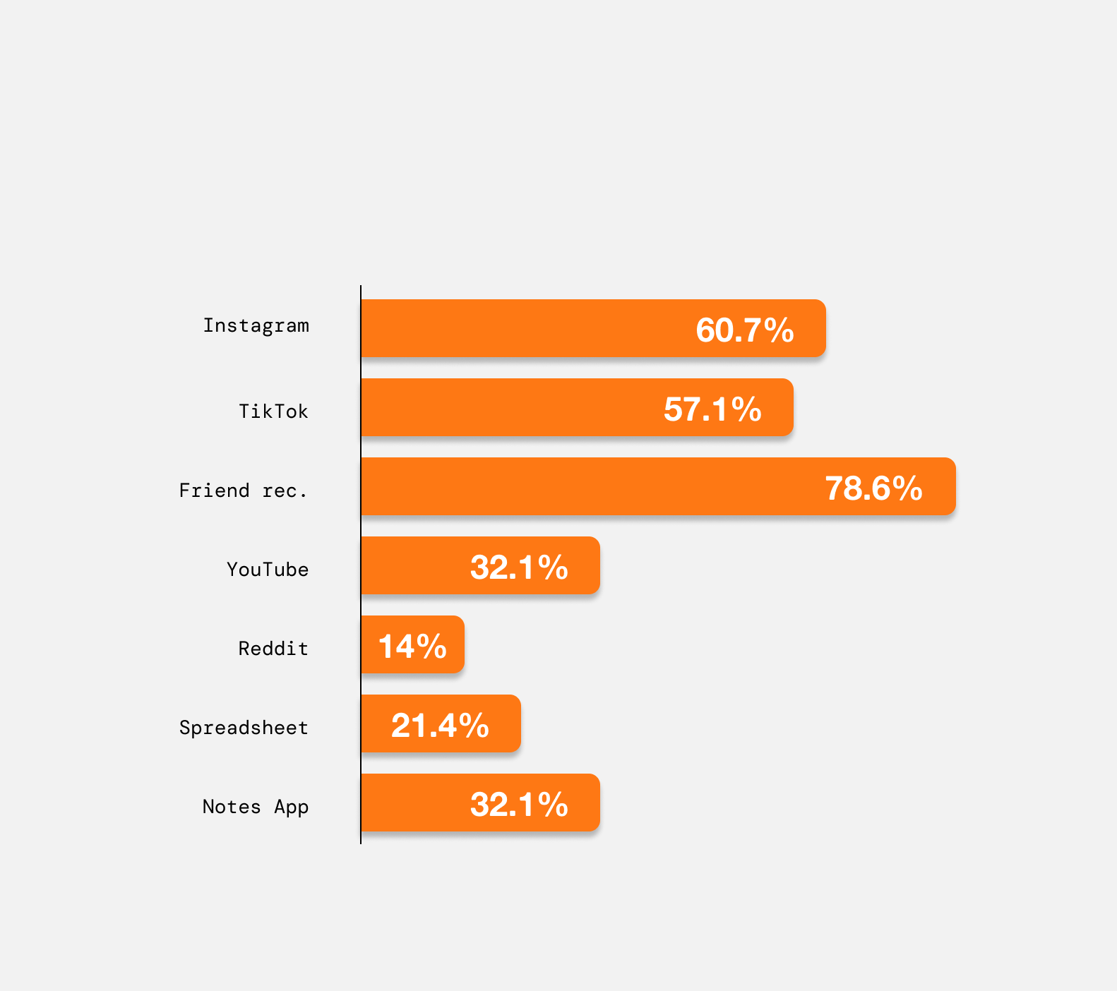
Travellers use multiple different apps to plan a single trip.
Friction between user and creation
PAIN POINT 2
Travellers want to scrapbook their experiences without the extra effort. Traditional scrapbooking happens after the trip and requires time and organisation that users may no longer have after the trip is over.
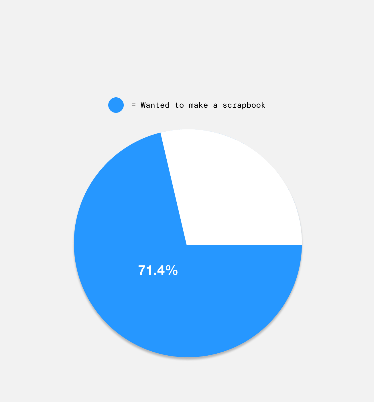
Many users confirmed they wanted to make a scrapbook after a trip, but didn't.
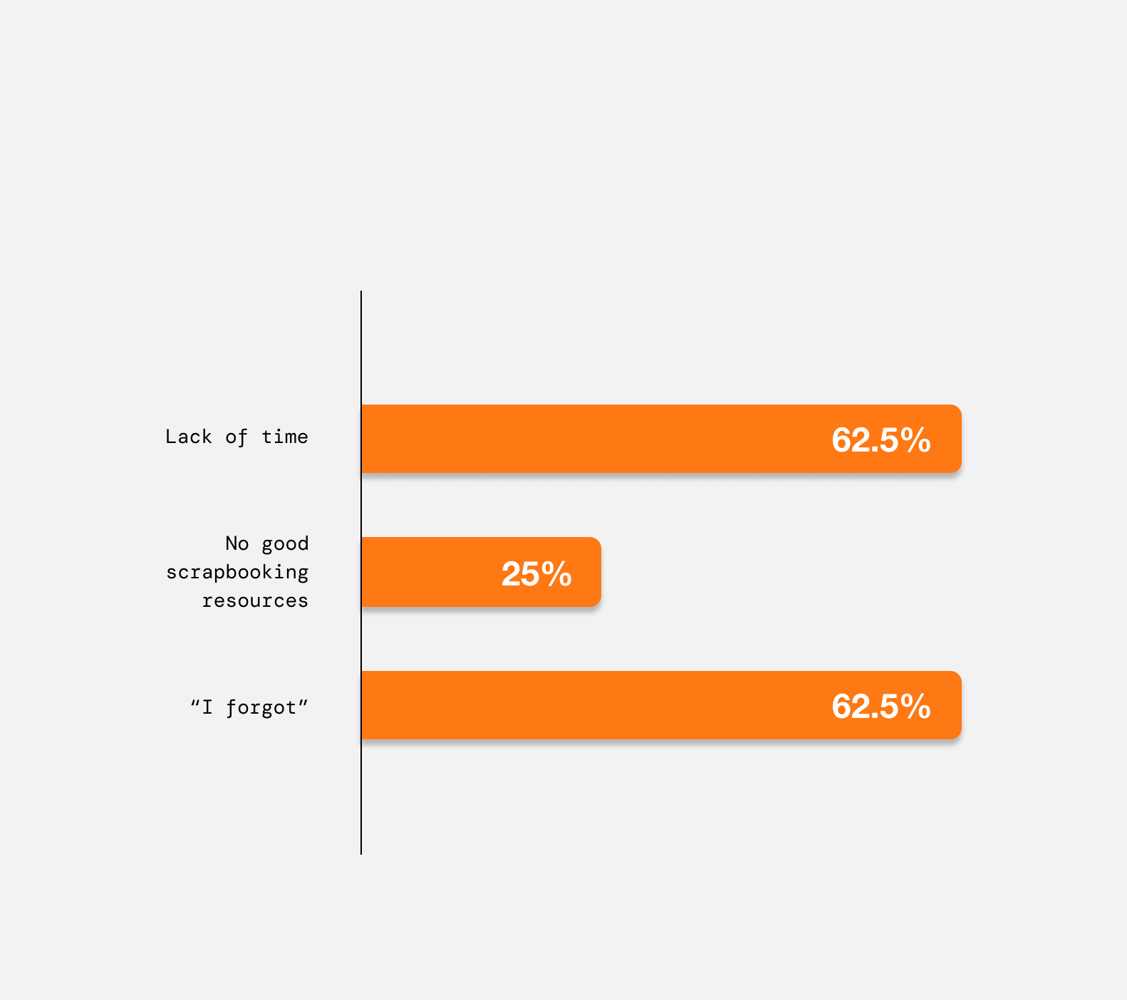
Travellers shared various reasons for not making a scrapbook post-trip.
Memories lose context
PAIN POINT 3
Although travellers want to preserve memories in a meaningful way, memories often become buried in camera rolls and disconnected from the places and experiences that they were created in.
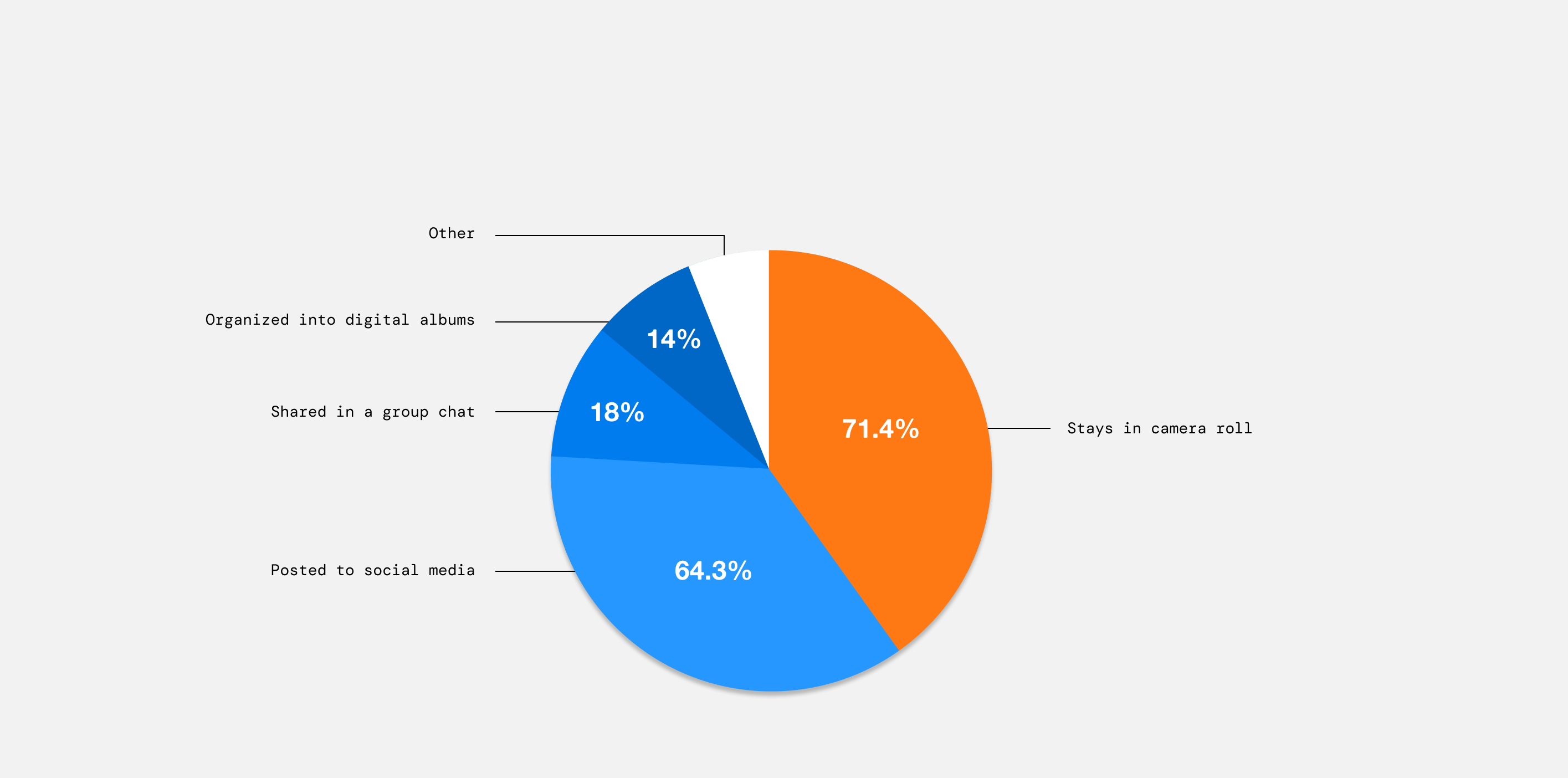
After a trip, captured pictures and videos end up in various places.
[ DECISIONS ]
Utilizing Apple's design language
I wireframed in Apple's existing design system, utilizing their visual and interaction patterns. Designing within Apple Maps made sense for its deep iPhone integration, meaning your camera roll, music, and contacts are all one tap away. Prototyping on mobile also means ScrapBooks fits naturally into the moments travel actually happens.
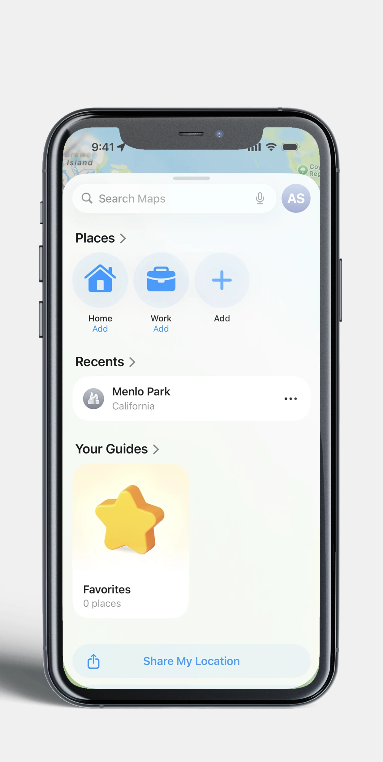
Apple Maps UI
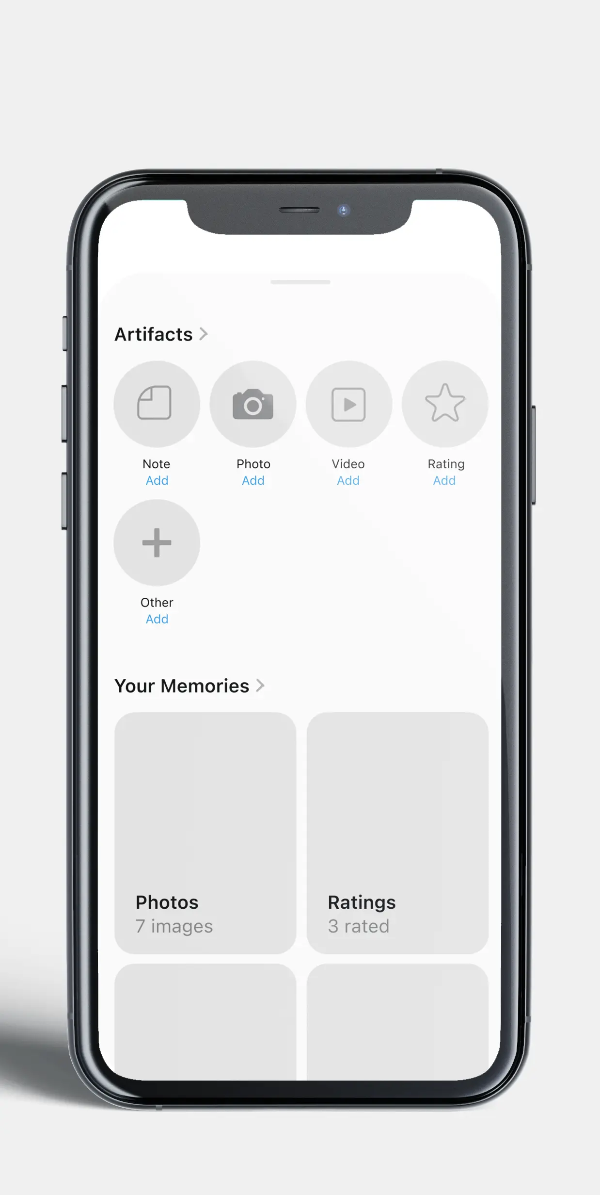
Lo-fidelity ScrapBooks UI
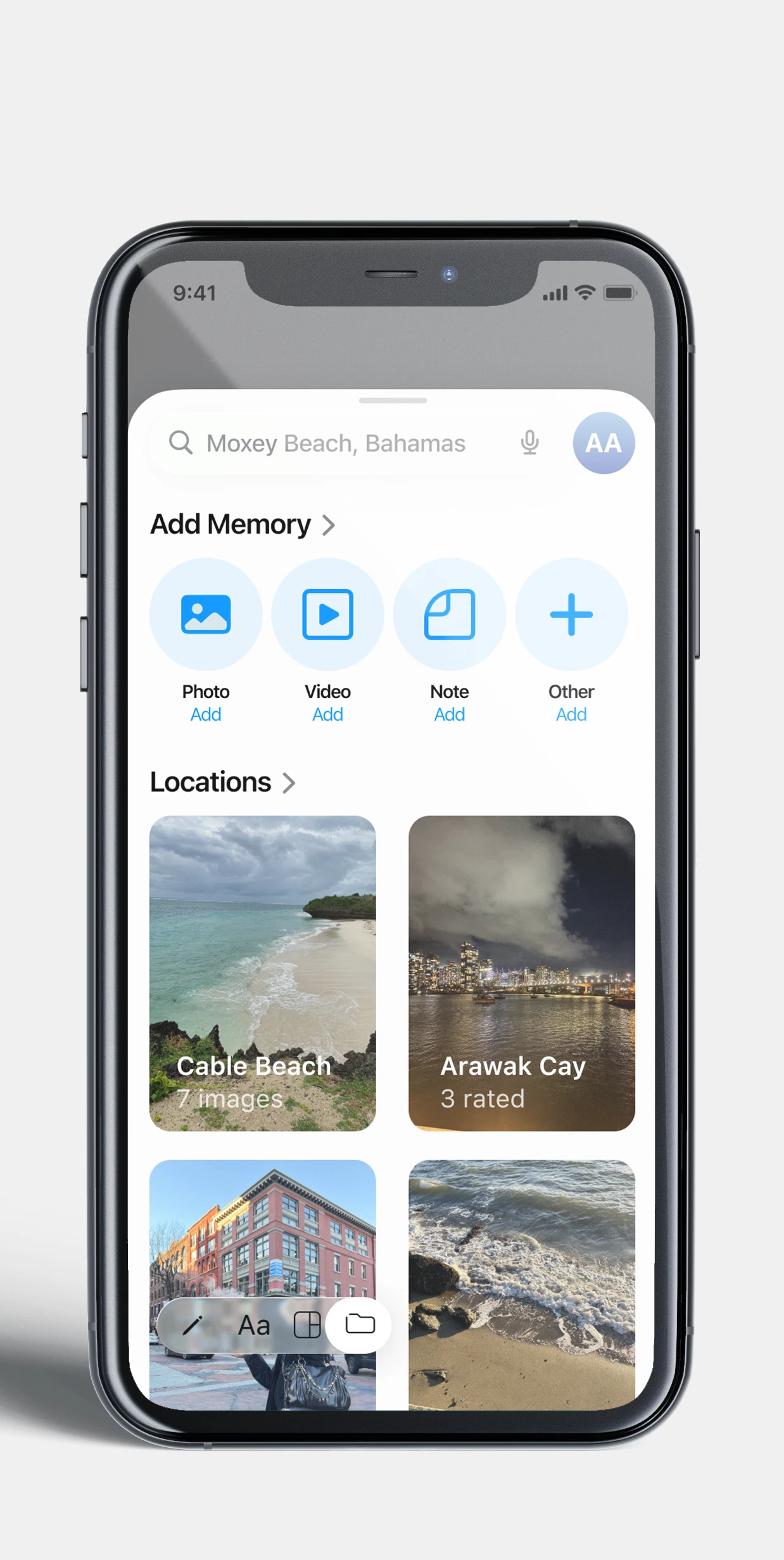
Final ScrapBooks UI
Simplified creation tools
Most scrapbooking tools have an overwhelming amount of creation tools to choose from, so I worked on redesigning simplified navigation with only the essentials, for quick and easy scrapbooking.
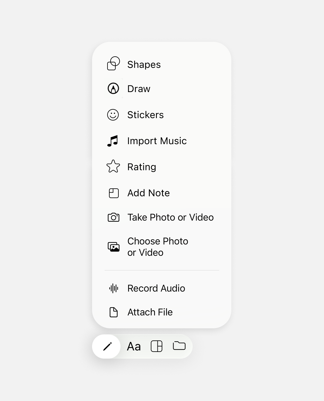
Post or keep private
We decided to build in three visibility options: share openly with the community for travel inspiration, share privately with a select group of friends, or keep it entirely to yourself. This gives users the same control they expect from any social platform, while making ScrapBooks feel personal rather than performative.
[ THE PITCH ]
Research & Inspo
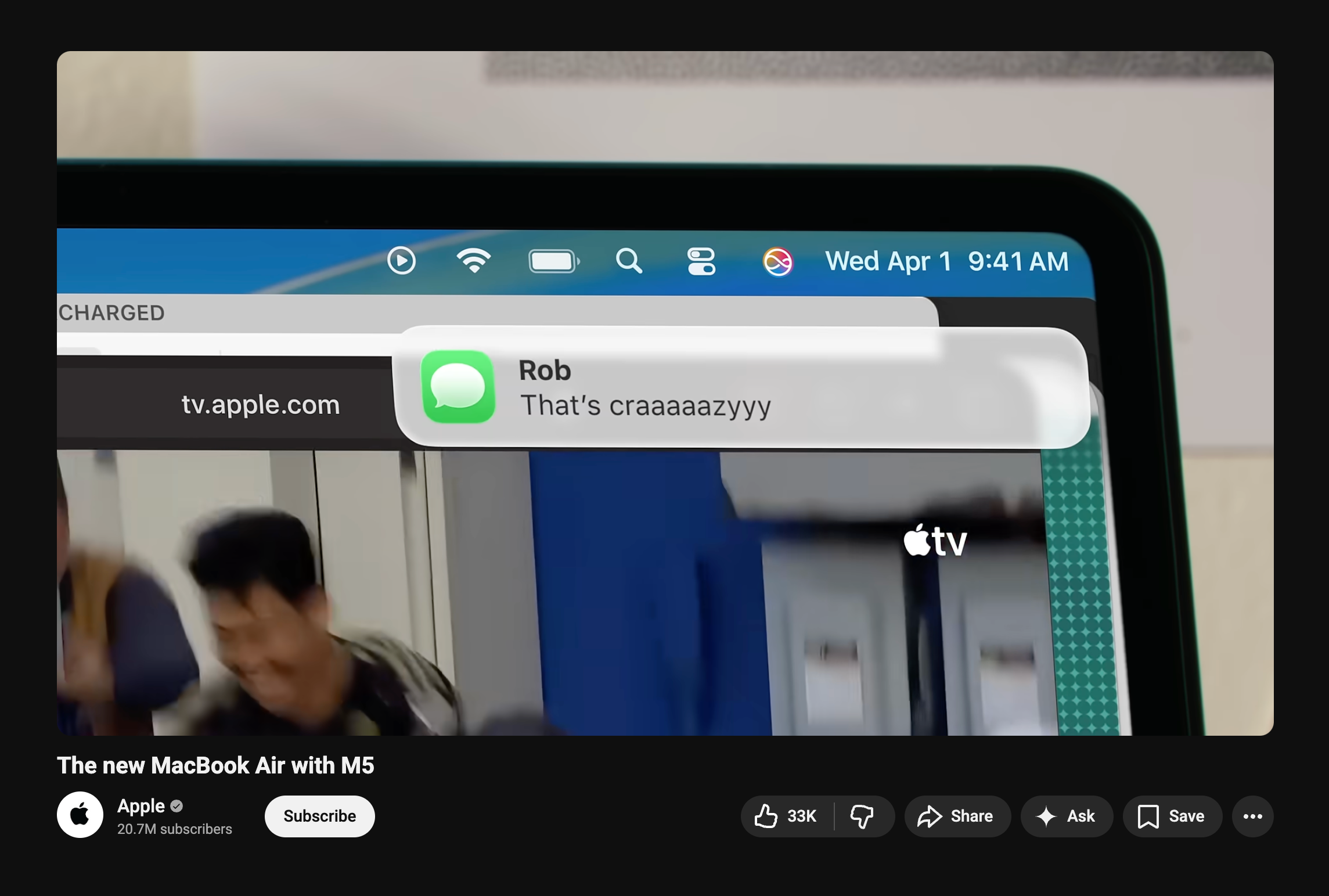
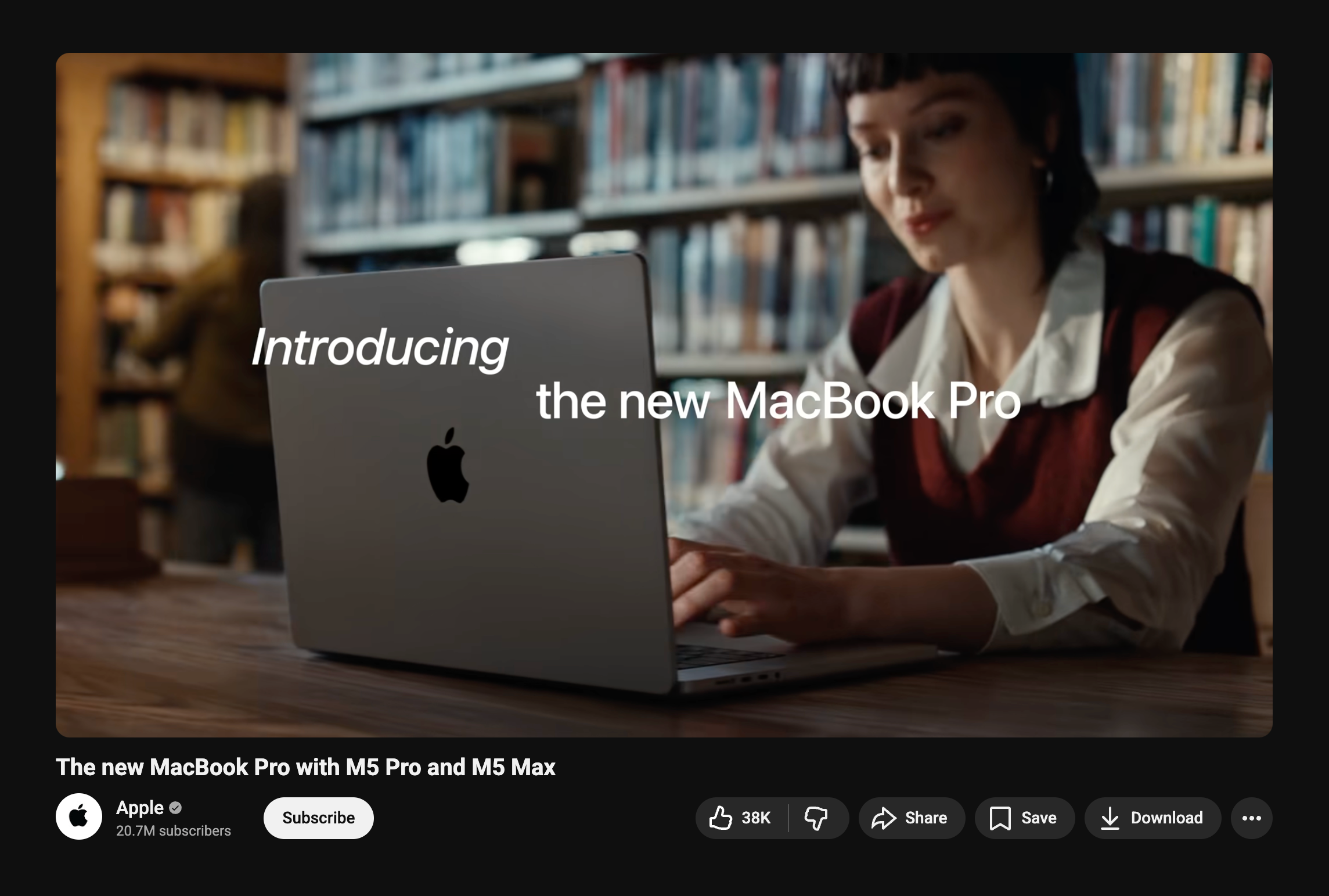
To stay true to Apple's design language, I studied their product launch videos, learning how they present the products solved problem, introduction of the user, and feature solutions using tight pacing, engaging audio, and continuous motion.
Storyboarding
The concept started as a single note: show people spiralling over chaotic trip-planning texts. From there, we storyboarded it into a full narrative arc.
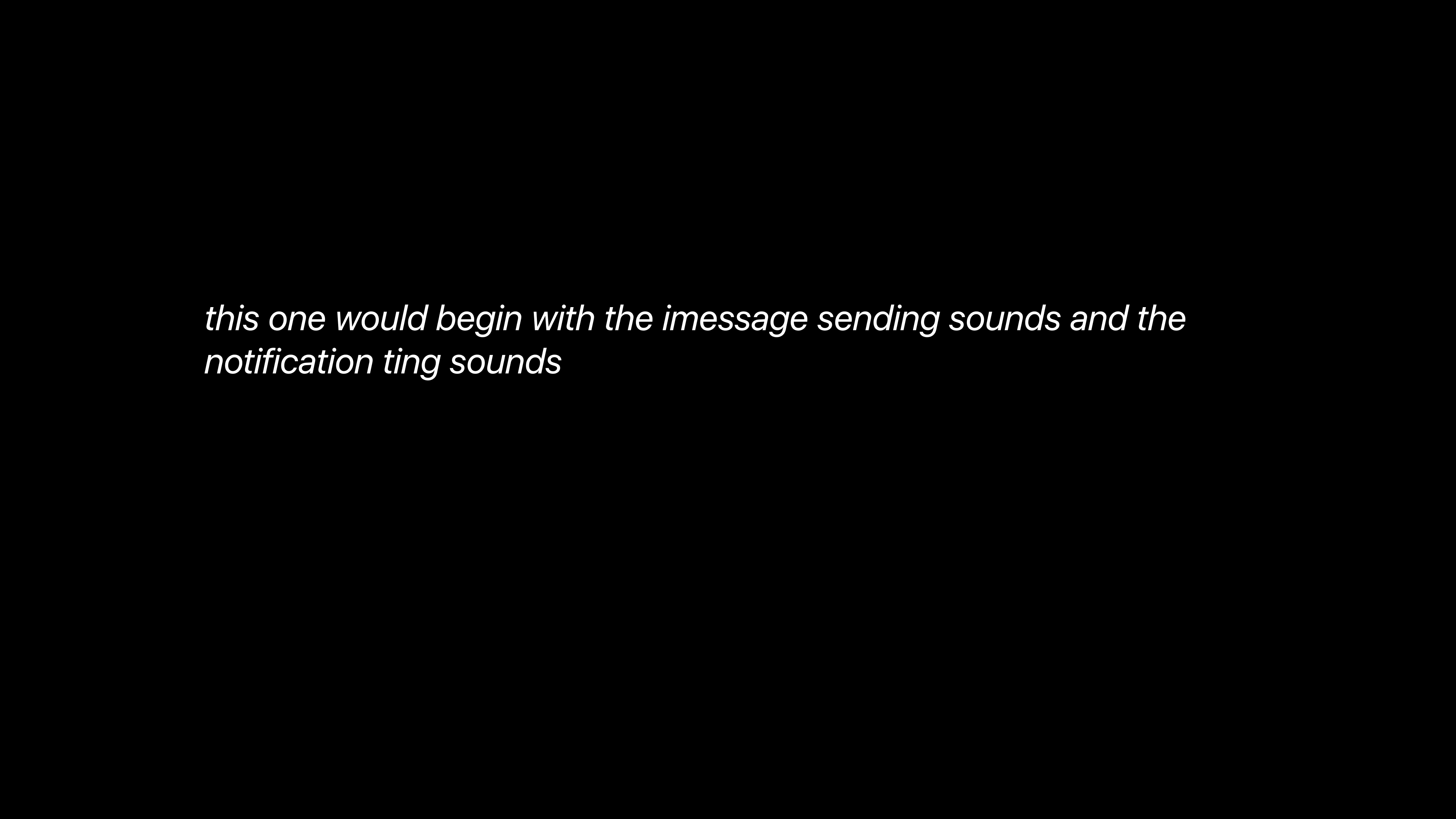
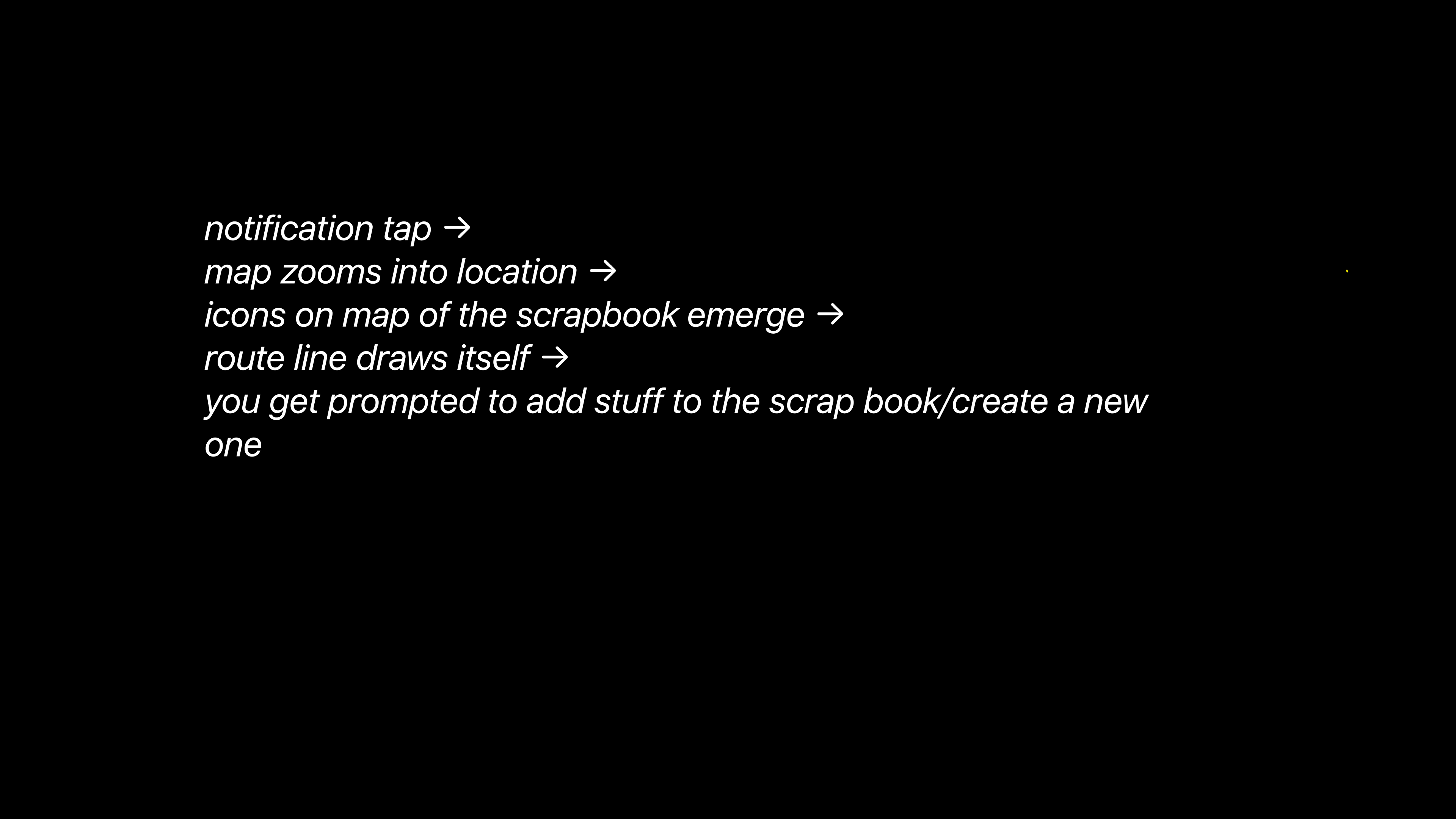
[ Initial storyboard frames 1 & 12 by Sumerah ]
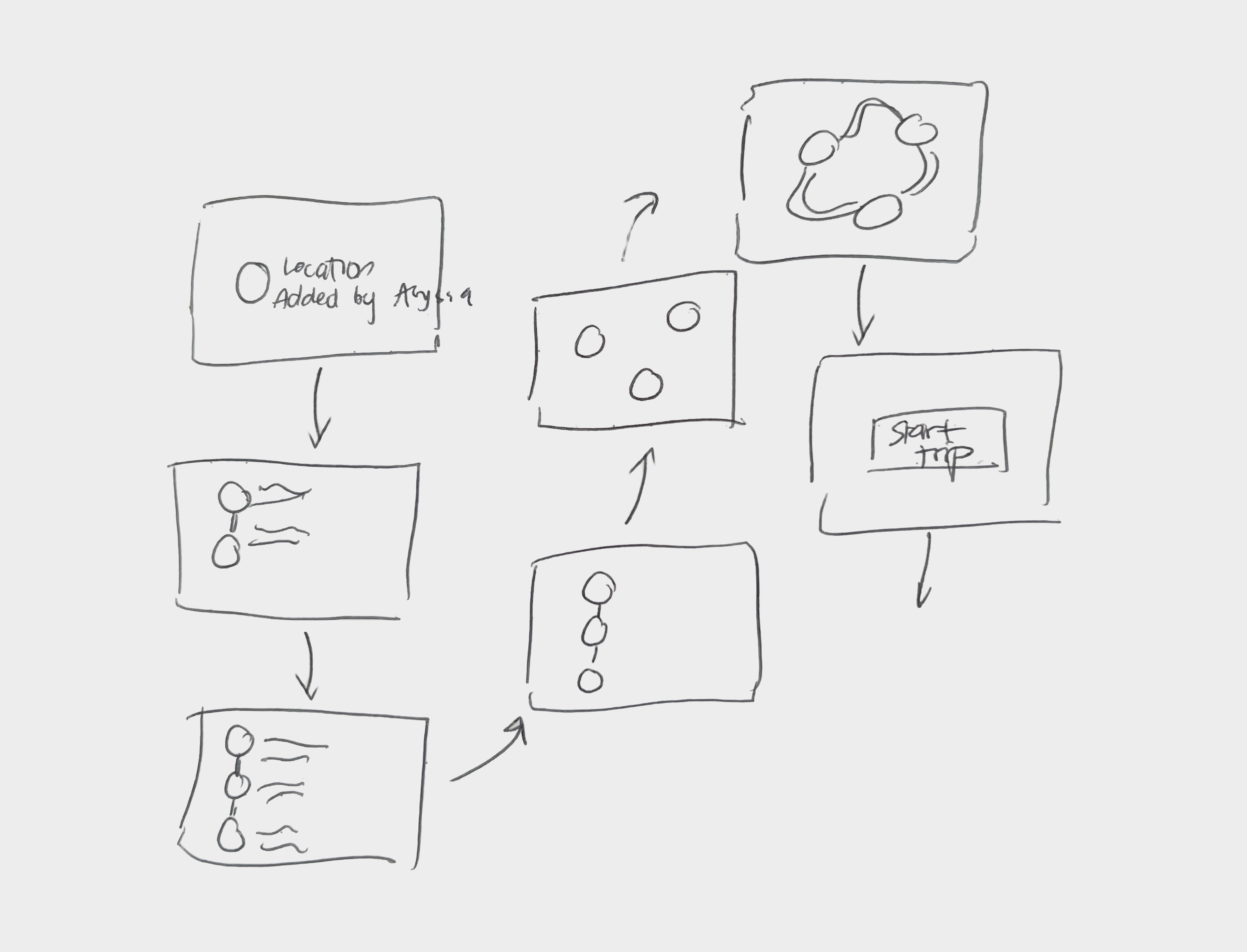
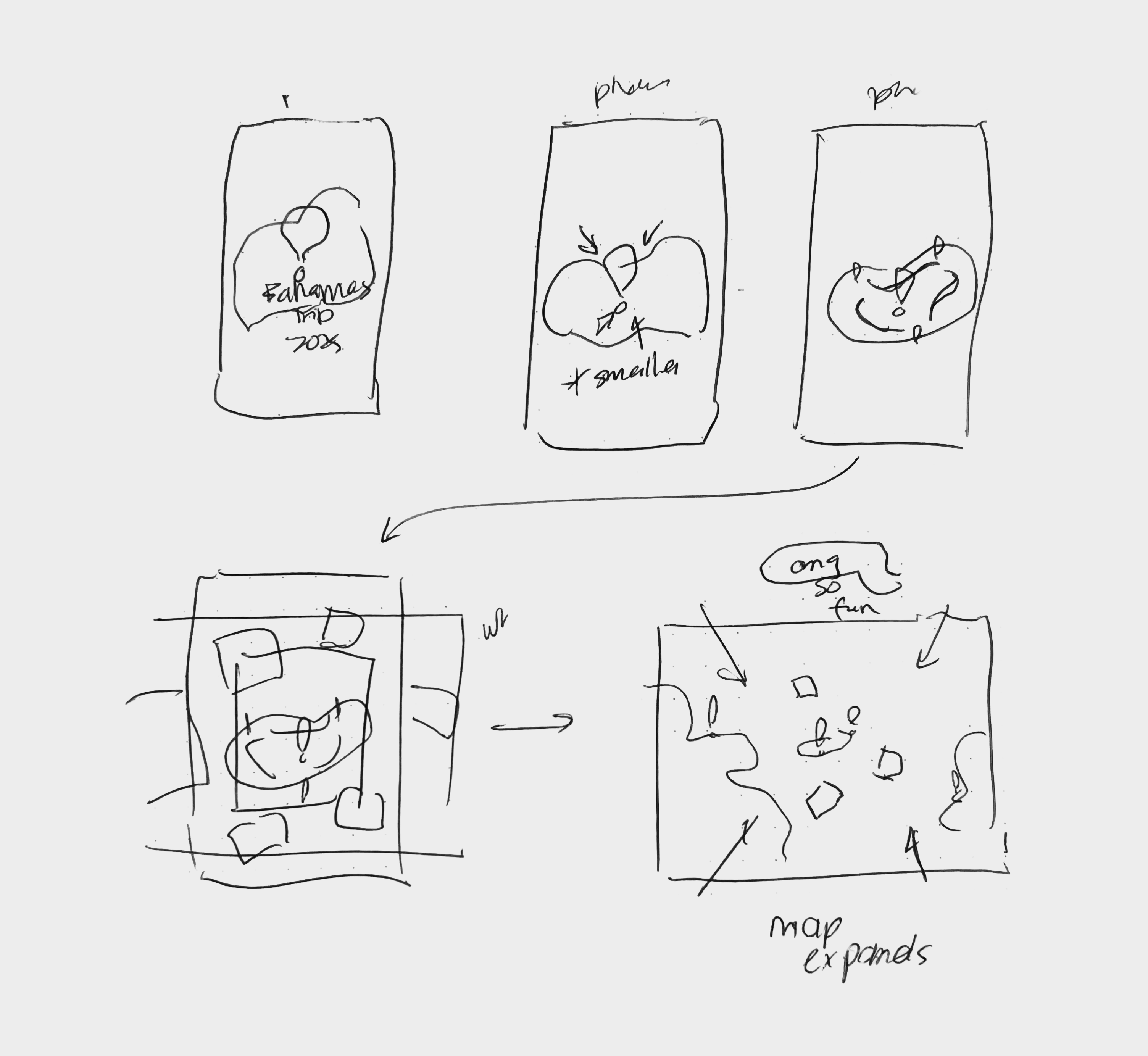
[ Key frame sketches by me ]
Bringing everything together
Scripting the voiceover, layering in sound effects, and refining the typography until everything felt considered and polished.
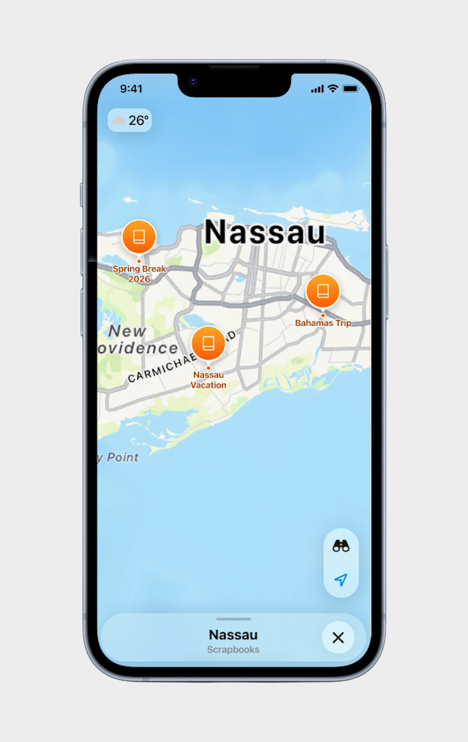
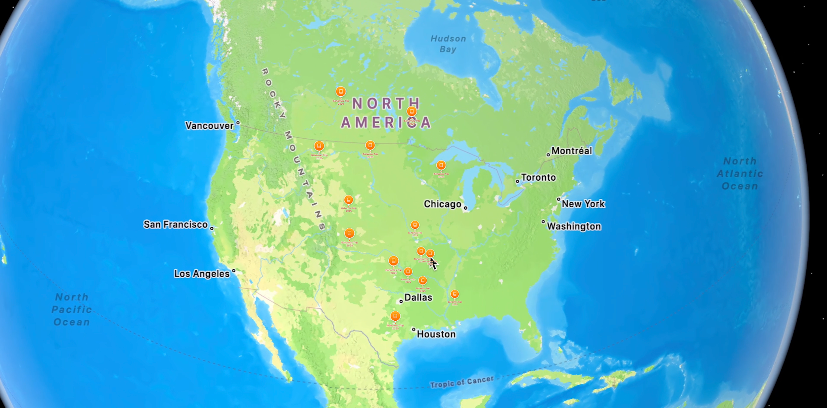
FINAL
ScrapBooks pitch video
[ Voiced & edited by me ]
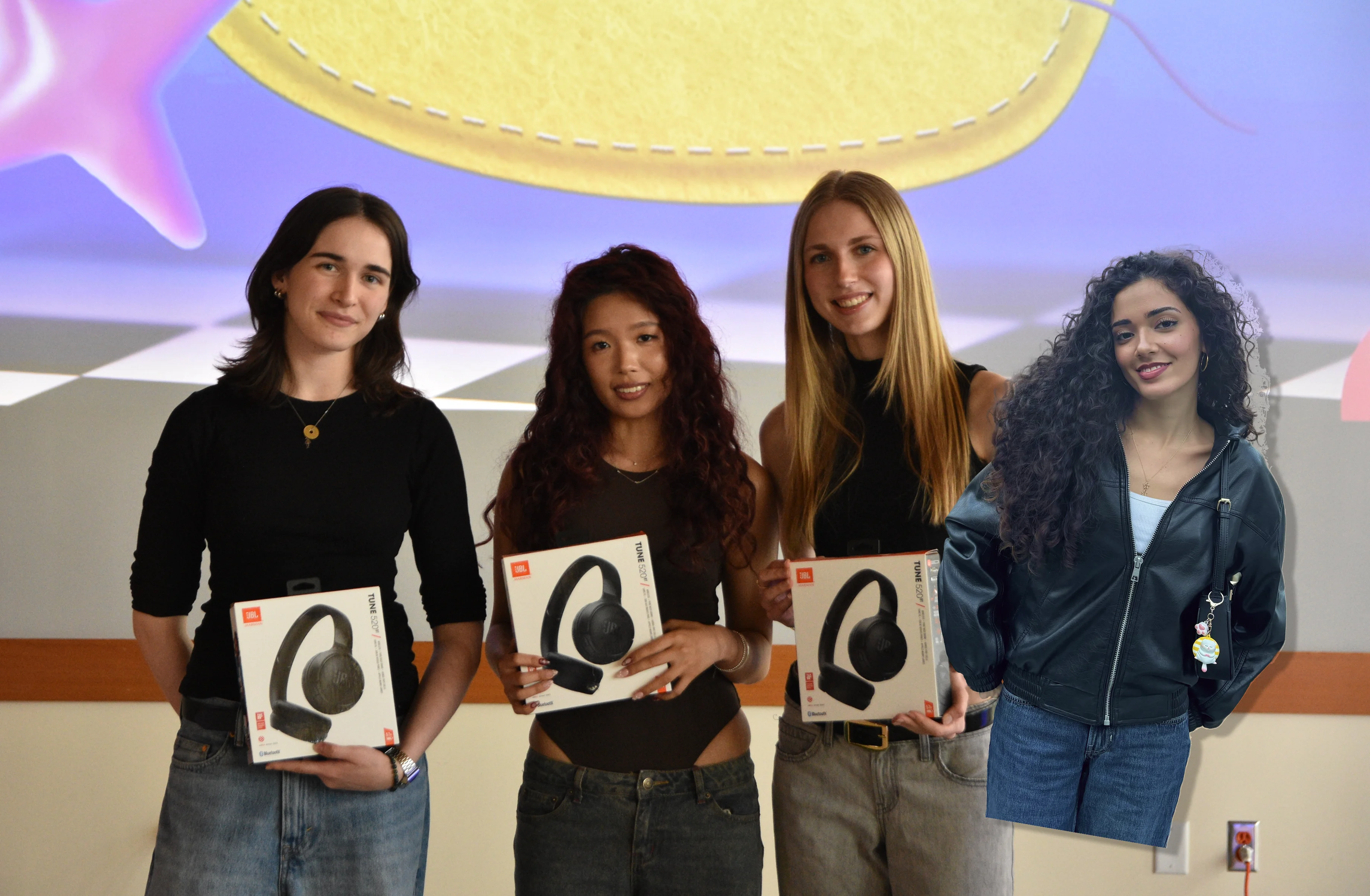
[ 1. Team photo w/ our prizes !! ]
[ 2. Our exhibition poster ]
[ TAKEAWAYS ]
Stay grounded in research
Running a survey before touching Figma meant our three pain points directly dictated our three core features. We never hit a moment of "so what are we actually building?" because the research had already answered that, this kept us moving fast without losing direction.
Constraints sharpen decisions
With only six days and a strict brief, there was no time to second-guess directions. Every decision had a filter: does this fit Apple's design language, does it solve the brief, can we build it in time? Having those guardrails made the design process smoother, with our team spending less time debating, & more time building.
[ NEXT PROJECT ]