'HOOLIGANG'
Motion Graphic
A kinetic typography project assigned as a first-year introduction to After Effects to the song 'HOOLIGANG' by Joey Valence & Brae.
Role
Typography
Motion
Illustration
Tools
After Effects
Illustrator
Timeline
Nov 2024
Team
Solo
Overview
An original motion graphic animation that interprets a dialogue clip through kinetic typography, combining design principles, movement, and self-created visuals to craft a rhythm based visual experience.
Process
1. Choosing a song
We were asked to choose a song that had lyrics we believed we could interpret visually, along with enough change in the beat that the video didnt feel too static. I brainstormed and listened to a couple different songs until finding one that flooded my mind with ideas and inspiration.
The song that provided the most creativity was the fast-paced song "HOOLIGANG", by hip-hop duo Joey Valence and Brae.
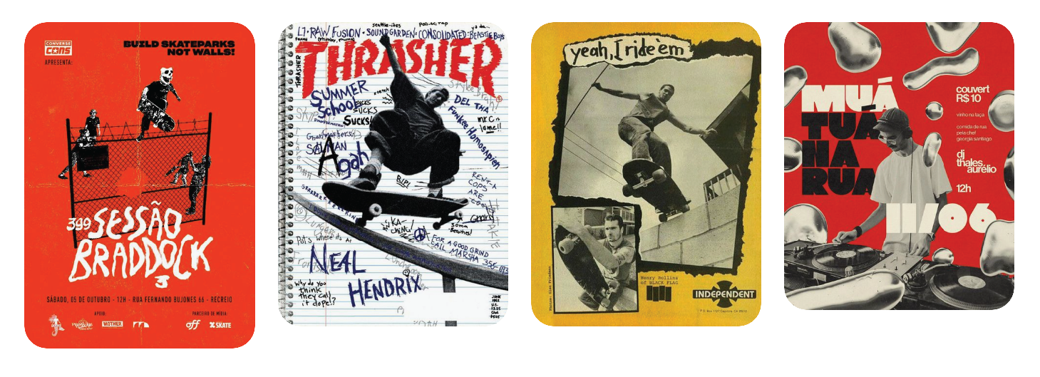
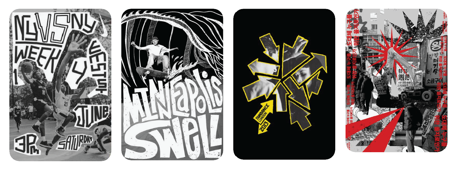
2. Research
I needed to now figure out a style that would portray this song appropriately, and so I found inspiration from images of skateboard magazines and movie posters, which contained bright colours and basic shapes.
3. Storyboarding
The following are the initial sketches of the main keyframes for this motion graphic, working out how each frame would move into the next, and which elements would need to be created.
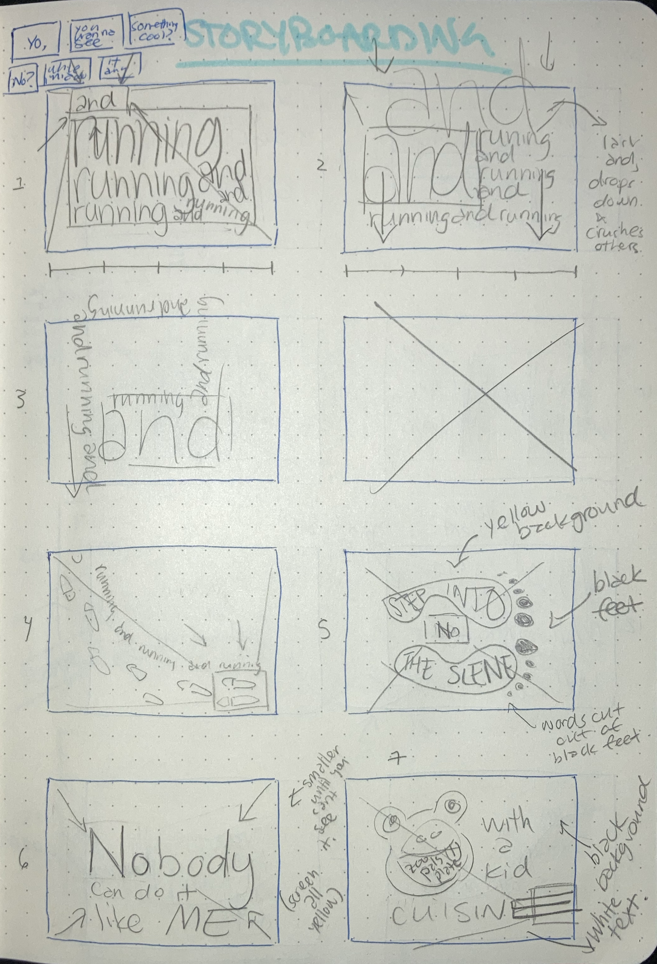
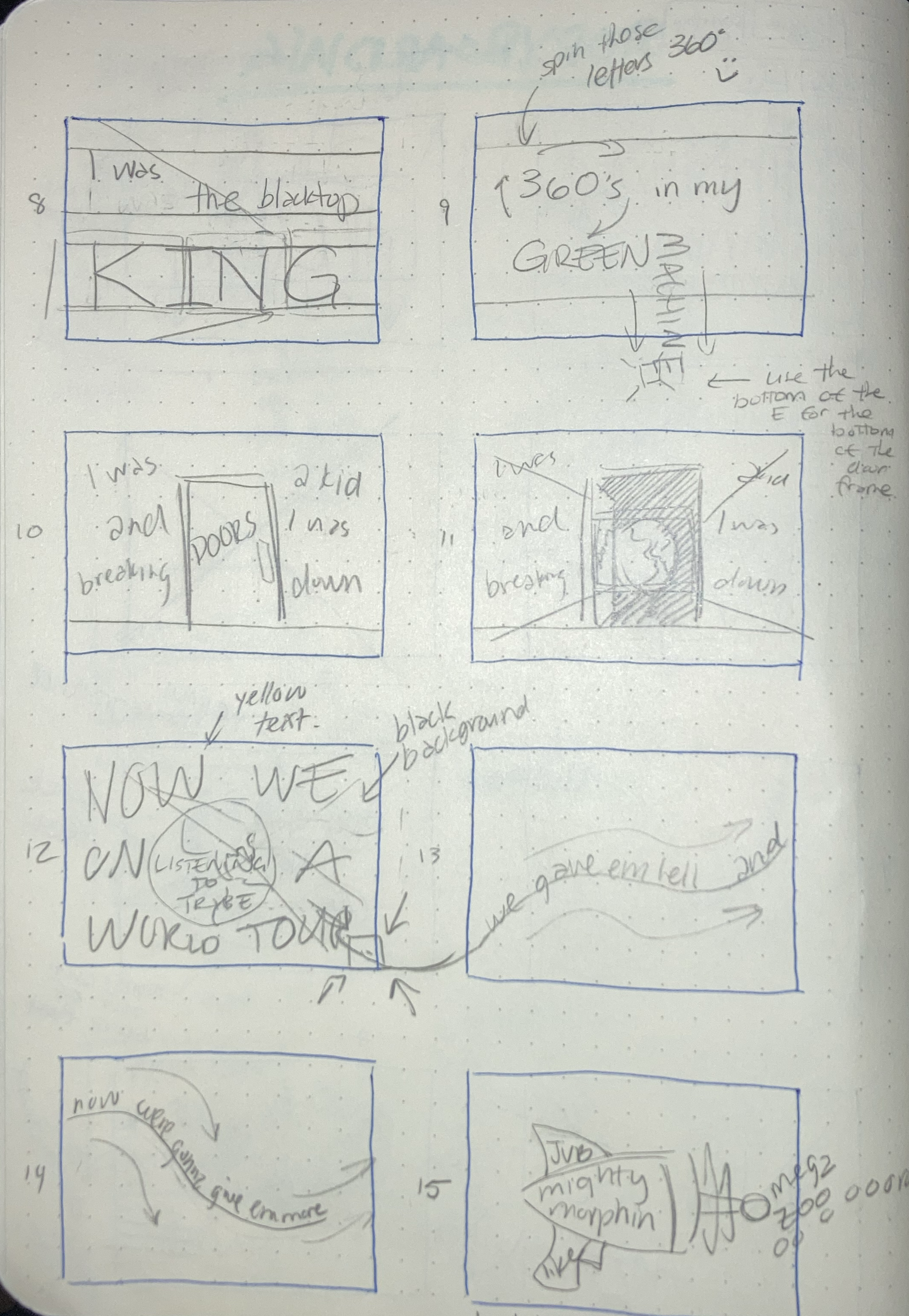
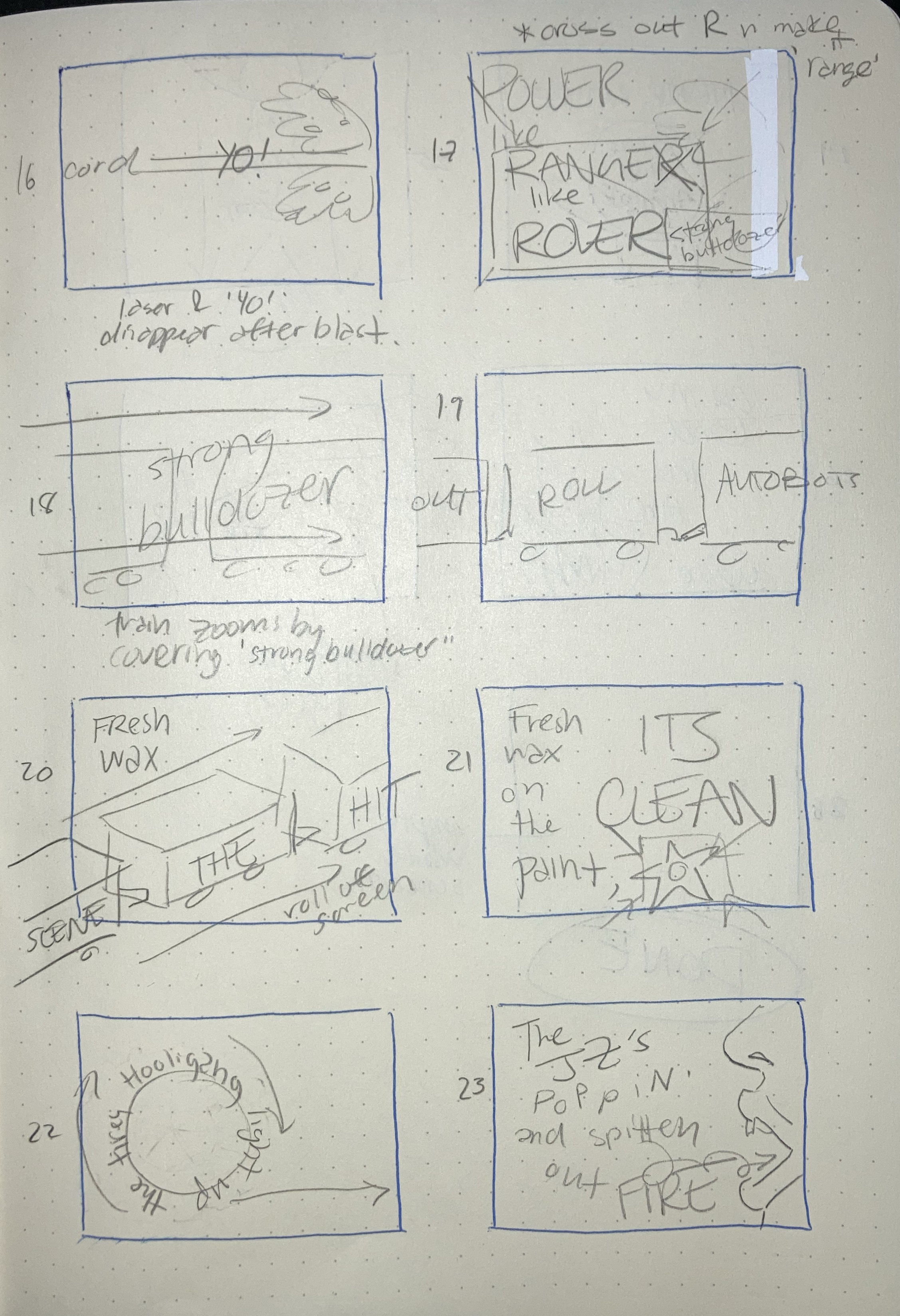
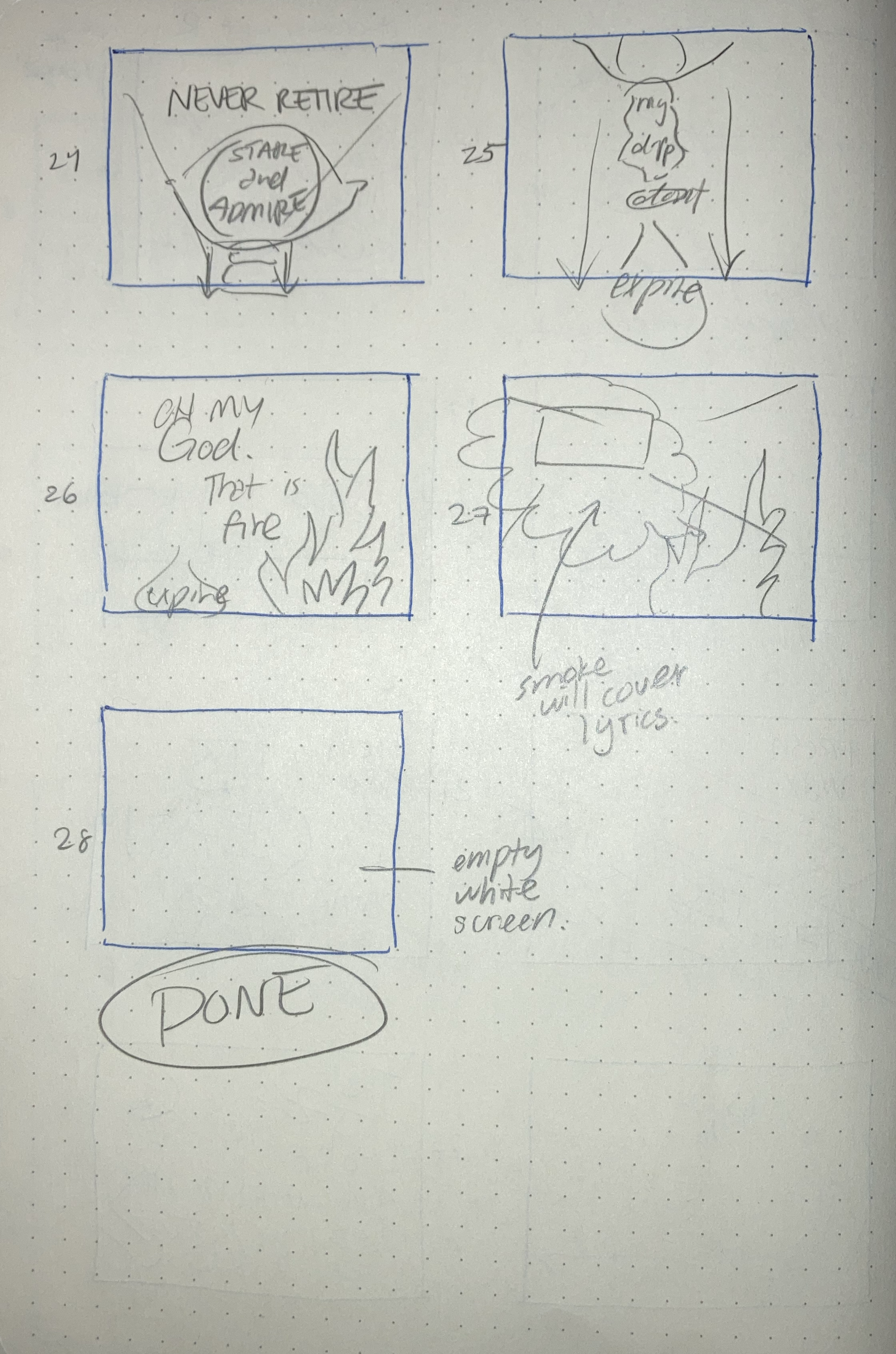
These were the initial sketches, and the exact compositions and transitions changed as the project progressed
4. Selecting visual elements
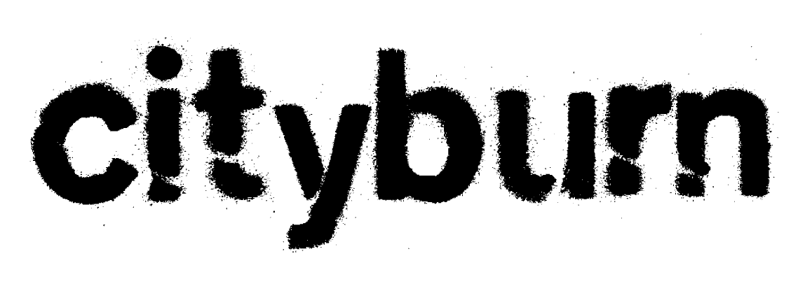
Font
'cityburn' typeface used for all text.
(afterthought: I wish I utilized a variety of font types, since only having one font gets repetitive throughout the video)
Graphics
Based on lyrics from the song, to visually portray the themes/language of the music.


Colour Palette
Inspired by music/skateboarding posters, which use black and white with a pop of color.
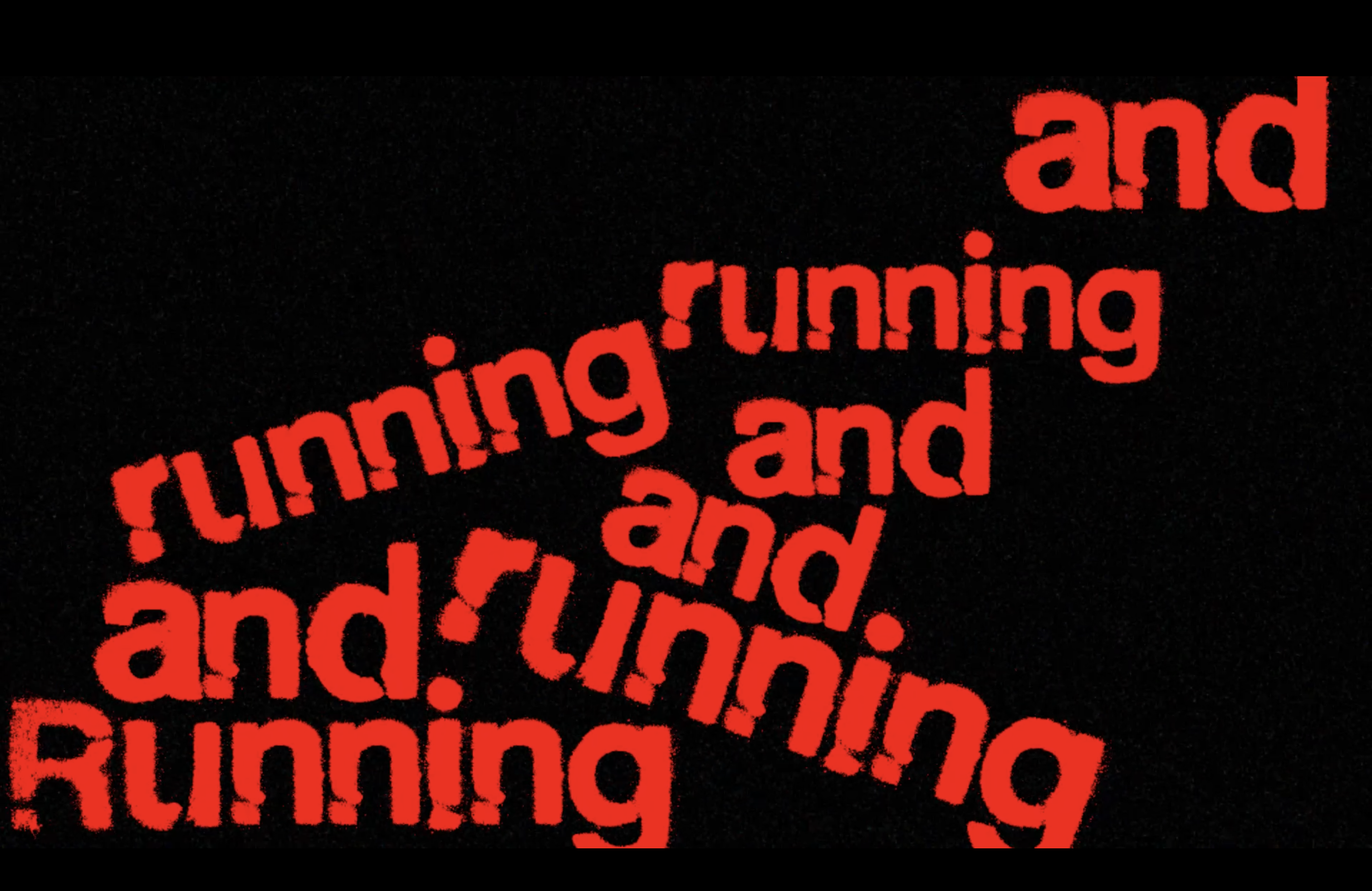
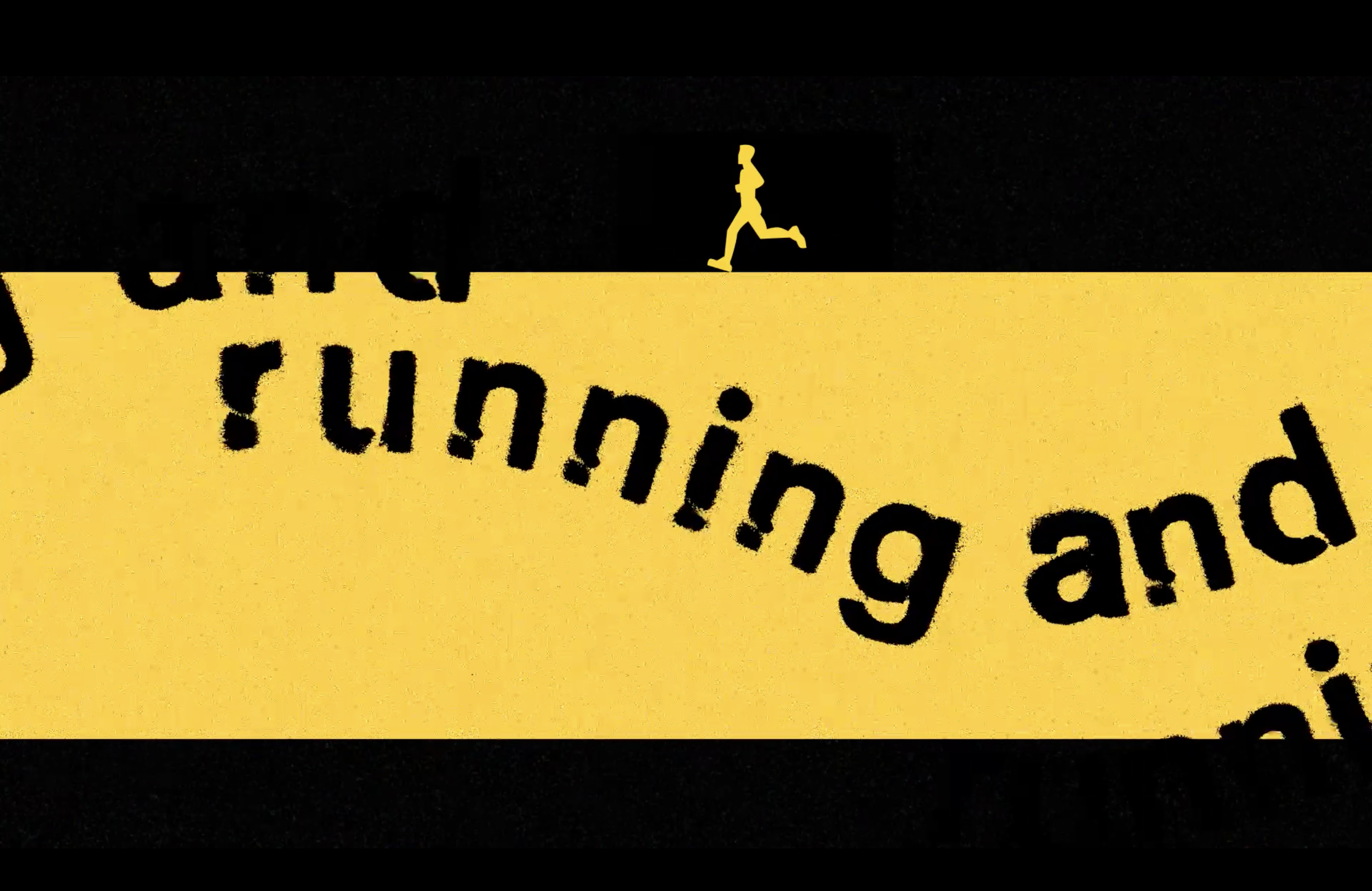
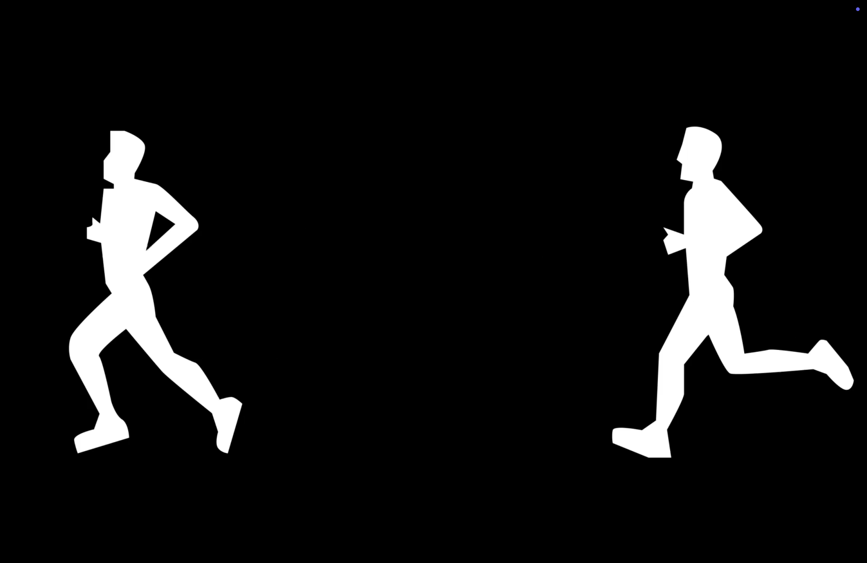
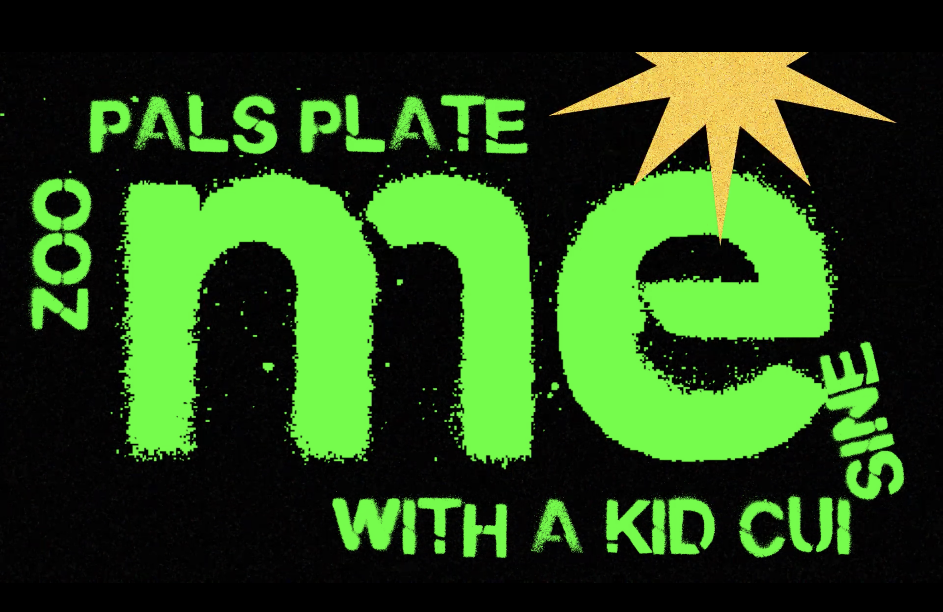
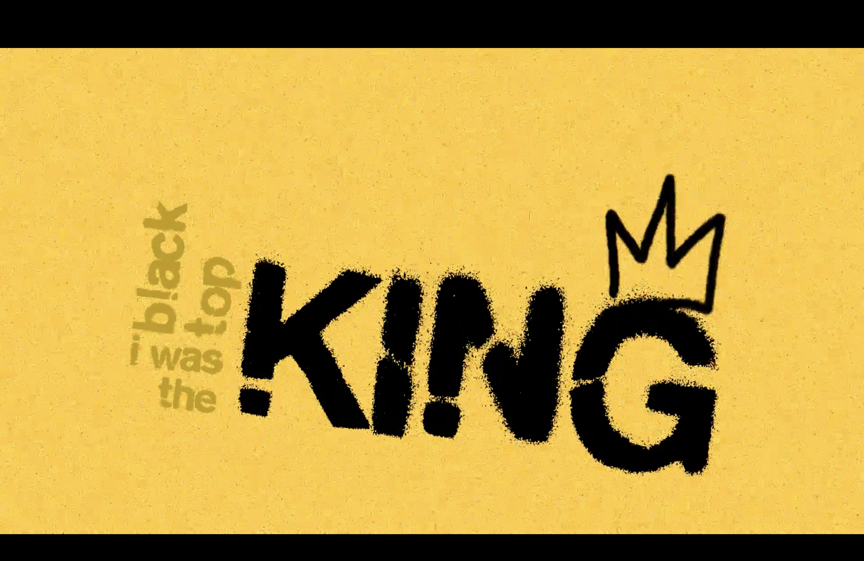
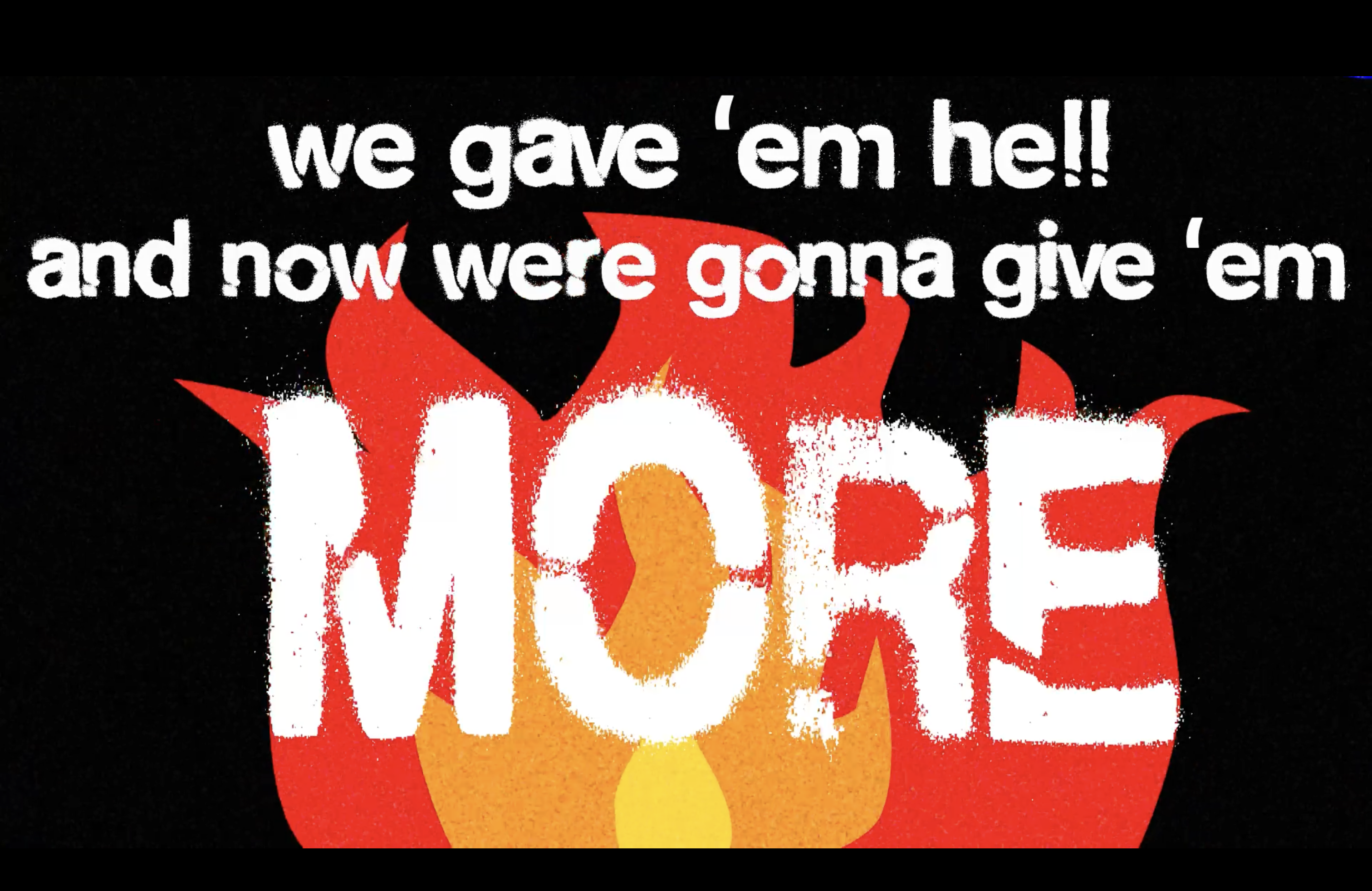
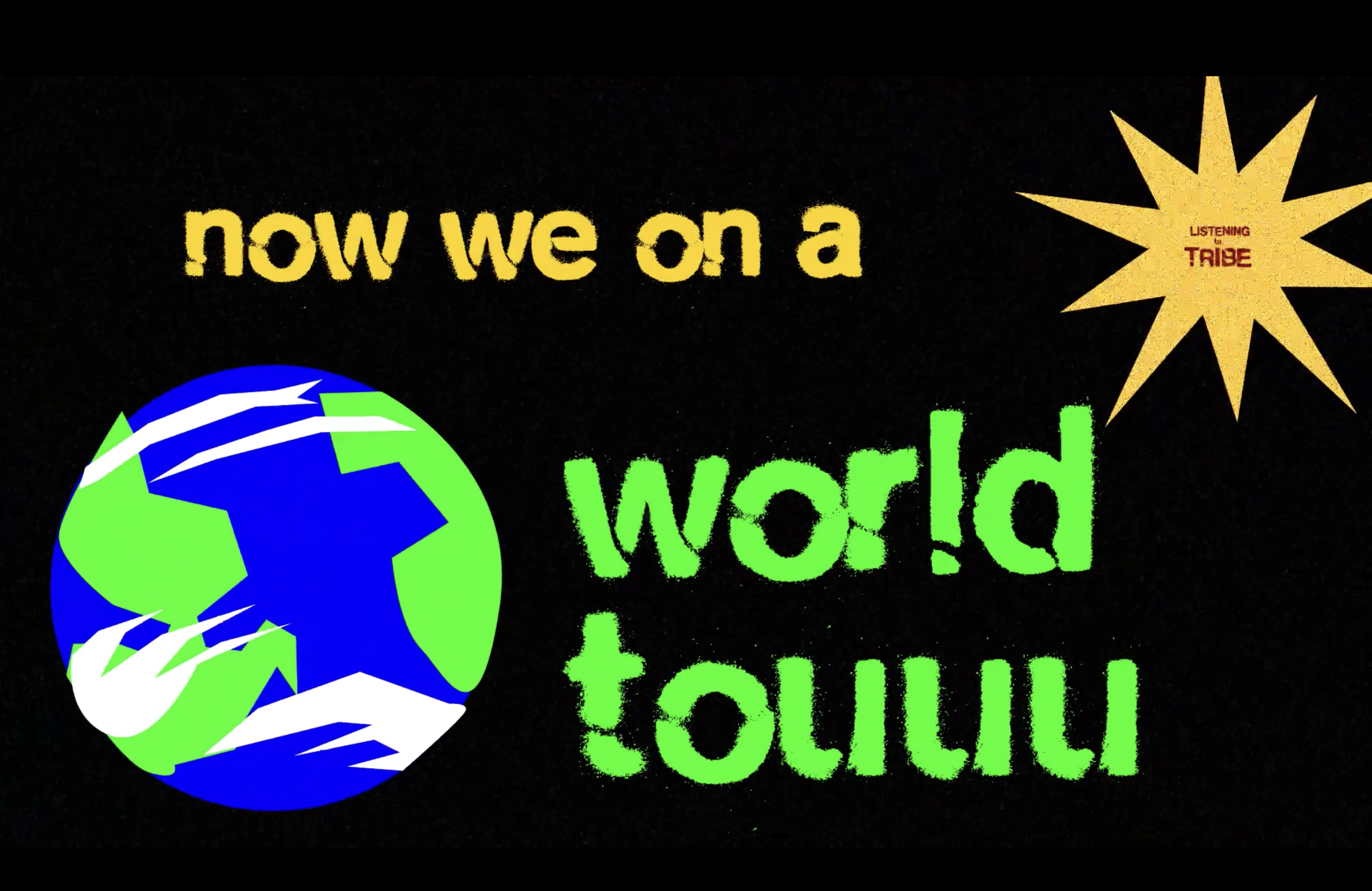
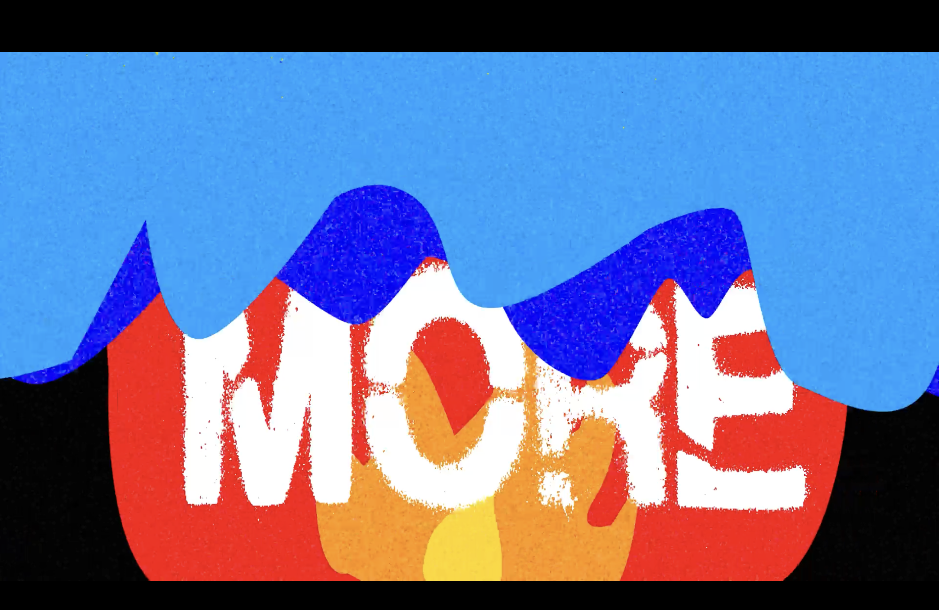
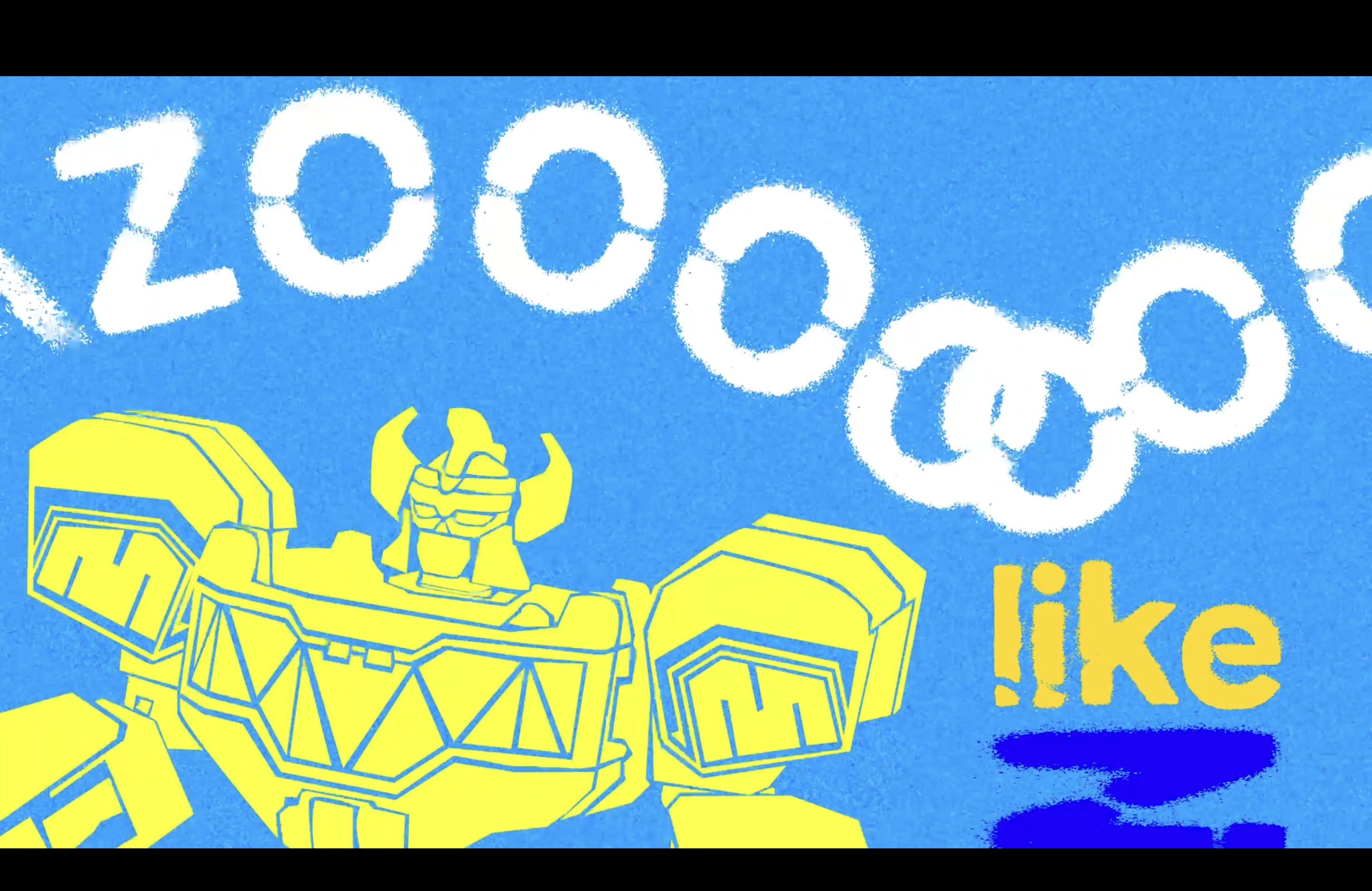
Outcome
The following are some of the keyframes from the video. Watch the full video here.
Reflection
Rhythm and timing are just as important as visual style in motion design.
This project taught me that effective kinetic typography relies heavily on pacing, flow, and alignment with audio—not just strong type and graphics. Planning keyframes early helped establish structure, but refining transitions and micro-movements is what ultimately creates a cohesive, rhythmic experience.
Future iterations would benefit from greater typographic and spatial exploration.
In a future version of this project, I would experiment with a wider range of typefaces to create more visual variation and emphasis throughout the animation. I would also make more intentional use of the camera feature in After Effects to introduce depth, movement, and a more dynamic 3D feel.